Photography forum image of the month – June 2013

Hi Photo lovers!

Every month on our pho­tog­ra­phy forum mem­bers nom­i­nate images that they like. Then at the end of the month I choose an excel­lent image and talk about why it rocks. The photo I choose is not nec­es­sar­ily the best one of the month. I’ve come to real­ize it’s not really log­i­cal to pit images from totally dif­fer­ent gen­res against each other. That’s why there are cat­e­gories in photo con­tests. I just choose a photo that has extremely strong ele­ments that we can learn from.

Just so it’s clear, the photo I choose is not nec­es­sar­ily the best one of the month. I’ve come to real­ize it’s not really log­i­cal to pit images from totally dif­fer­ent gen­res against each other. That’s why there are cat­e­gories in photo contests. 

My goal is to sim­ply choose an excel­lent photo and talk about why I think it rocks. This month was another crazy hard month though as the nom­i­na­tions from dif­fer­ent gen­res were of very high quality.

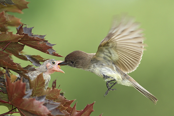
This month’s choice is Fos­ter­ing by Mike Bons Fos­ter­ing.

Fostering by Mike Bons

Fos­ter­ing by Mike Bons


I chose this image for a few reasons:

1 — Focal point sharp­ness and deci­sive moment — Look at the sharp­ness on the eye of the baby bird, it’s just gor­geous. The tim­ing is equally gor­geous; the hummingbird’s beak is inside the chick’s mouth and we can see a hint of a bug. The hummingbird’s legs are won­der­fully frozen. Mike explains in his post that he used a ‘trig­ger­trap’ to trig­ger the shut­ter from yards away and I just love the use of this new tech­nol­ogy to help us make bet­ter images. I also applaud the ded­i­ca­tion to set­ting this all up and wait­ing patiently.

2– Com­po­si­tion — Fram­ing here is bang on as is the guid­ing of our eyes which go right to the chick. I really like the shape of the hummingbird’s blurred wings. I also like the leaves that are included at the oppo­site side of the frame and the free space around the hummingbird.

3 — Shut­ter speed — Won­der­ful choice of high shut­ter speed to get sharp­ness like that on the chick and the frozen hum­ming­bird legs. The motion-blurred hum­ming­bird wings add to this image big­time and are a tes­ta­ment to how fast that lit­tle bug­ger flaps its wings per second.

For all these rea­sons, this is my choice for image of the month. Since we all have opin­ions, some mem­bers may dis­agree with my choice. That’s cool but THIS thread is not the place for debate over my pick, NOR is it the place to fur­ther cri­tique the image. The pur­pose here is to sug­gest strong ele­ments in the photo that we may learn from.

Con­grats Mike Bons!
The Montreal Jazz Fest — Mucca Pazza invades

Hi every­one,

I’ve added a new cat­e­gory to the blog called Mon­treal art, pho­tog­ra­phy and cul­ture and I’ll use it to cover some of the cooler events in this fes­ti­val city that I call home. Even if you can’t make it to Montreal’s world class fes­ti­vals, hope­fully this new pho­tog­ra­phy blog cat­e­gory can turn you on to some­thing new.

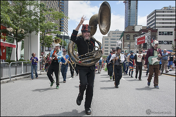
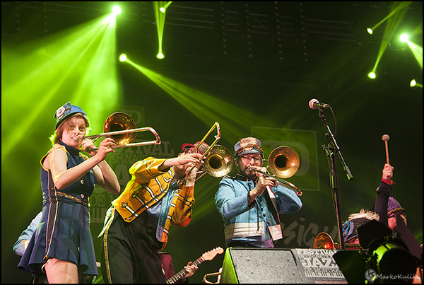
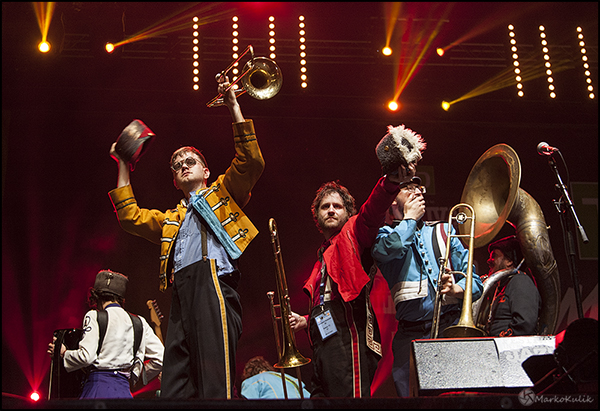
This week the world famous Mon­treal Inter­na­tional Jazz fes­ti­val is in town and it fea­tures hun­dreds of world class musi­cal acts and street per­for­mances. The Jazz fes­ti­val is one of the best fes­ti­vals in our city and I attend almost every year. This year a friend of mine, Mon­treal Cul­ture Guy Chris ‘Zeke’ hand, invited me to see a 30 piece Chicago Hip­ster march­ing band called Mucca Pazza. They were so fab that I saw them twice. Had I had more time I would have gone again.

This band INSTANTLY makes you smile and makes your brain release endor­phins. Just try not to smile when you see them, I dare you!  Instead of tak­ing Prozac, just watch Mucca Pazza.

The music is a jazz-based fusion to my ear and is per­formed extremely well —  in  ‘we do not take our­selves seri­ously for even a nanosec­ond’ disco meets the civil war cos­tum­ing. The chore­og­ra­phy is crazy fun as well with cheer­lead­ers lit­er­ally thrown into the mix. Did I say this is the most fun I’ve had at the  Mon­treal Jazz fest in years? Well it is!

Mucca Pazza at the Montreal Jazz fest

Mucca Pazza at the Mon­treal Jazz fest


Mucca Pazza at the Montreal Jazz fest

Mucca Pazza at the Mon­treal Jazz fest


Mucca Pazza at the Montreal Jazz fest

Mucca Pazza at the Mon­treal Jazz fest

Mucca Pazza at the Montreal Jazz fest

Mucca Pazza at the Mon­treal Jazz fest

Mucca Pazza at the Montreal Jazz fest

Mucca Pazza at the Mon­treal Jazz fest


119 — Manipulating Photojournalism — Interview with Moe Doiron

Pho­tog­ra­phy pod­cast #119 is the sec­ond of two episodes ded­i­cated to manip­u­la­tion in pho­to­jour­nal­ism. In this episode we fea­ture a 70 minute casual con­ver­sa­tion with Moe Doiron, a pho­to­jour­nal­ist with The Globe and Mail, Canada’s largest National Newspaper.

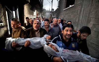
In the inter­view we revisit the 2012 win­ning world press photo by Paul Hansen, dis­cuss the Chicago Sun-Times fir­ing of their Pho­to­jour­nal­ism staff and chat about Moe’s multi-decade career as a pho­to­jour­nal­ist. and photo editor.

Past World Press Photo winners - Click to enlarge

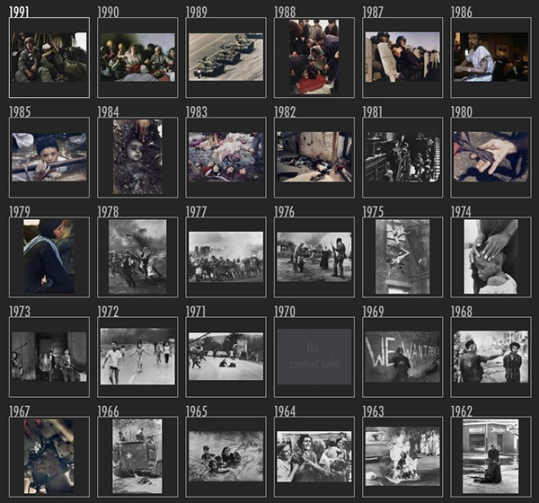
Past World Press Photo win­ners from the archives  - Click to enlarge the full set from 1955–2009


Links /resources men­tioned in this pod­cast:
World Press Photo of the year (Large)
A pet’s per­spec­tive — Low angled images — Photography.ca forum’s reg­u­lar assign­ment — June 2013
f/16 or smaller — Photography.ca forum’s level 2 assign­ment — June 2013
Pho­tog­ra­phy Pod­cast 118 — Manip­u­lat­ing Pho­to­jour­nal­ism — Inter­view with Carl Neustaedter

PLEASE NOTE THAT IF YOU USE GOOGLE READER TO SUBSCRIBE TO THIS SITE, YOULL NEED TO CHOOSE ANOTHER SUBSCRIPTION METHOD ASAP AS GOOGLE READER WILL HAVE ITS FUNERAL ON JULY 1. JUST GO TO THE TOP RIGHT ON ANY PAGE TO CHOOSE ANOTHER SUBSCRIPTION METHOD.

If you liked this pod­cast and want to review it on Itunes, this link gets you to the main page

If you are inter­ested in writ­ing for our blog please con­tact me photography.ca ( A T ) G m ail Dot co m (using stan­dard email formatting)

Please join the Photography.ca fan page on Facebook

My Face­book pro­file — Feel free to “friend” me — please just men­tion Photography.ca
My Twit­ter page — I will fol­low you if you fol­low me — Let’s con­nect — PLEASE email me and tell me who you are in case I don’t rec­i­p­ro­cate because I think you are a spammer.

If you are still lurk­ing on our forum,
feel free to join our friendly :)  Pho­tog­ra­phy forum

Thanks to Jason, Juliet O’Neill and Yise­haq who posted a blog com­ment about our last pod­cast. Thanks as well to every­one that sent com­ments by email about our last pod­cast. Although ALL com­ments are appre­ci­ated, com­ment­ing directly in this blog is pre­ferred. Thanks as well to all the new mem­bers of the bul­letin board. Most of the links to actual the prod­ucts are affil­i­ate links that help sup­port this site. Thanks in advance if you pur­chase through those links.

If you are look­ing at this mate­r­ial on any other site except Photography.ca — Please hop on over to the Photography.ca blog and pod­cast and get this and other pho­tog­ra­phy info directly from the source. |Sub­scribe with iTunes|Sub­scribe via RSS feed |Sub­scribe for free to the Pho­tog­ra­phy pod­cast — Photography.ca and get all the posts/podcasts by Email

You can down­load this pho­tog­ra­phy pod­cast directly by click­ing the pre­ced­ing link or lis­ten to it almost imme­di­ately with the embed­ded player below.

Thanks for lis­ten­ing and keep on shooting!

118 — Manipulating Photojournalism — Interview with Carl Neustaedter

Pho­tog­ra­phy pod­cast #118 is the first of two episodes ded­i­cated to manip­u­la­tion in pho­to­jour­nal­ism. This first episode fea­tures an inter­view with Carl Neustaedter who is the deputy edi­tor of the Ottawa Cit­i­zen, the largest daily news­pa­per in Ottawa, Ontario, Canada. Carl is one of the peo­ple who decides on a daily basis what images make it into the newspaper.

In this inter­view we dis­cuss how much manip­u­la­tion is too much manip­u­la­tion when it comes to news photography.

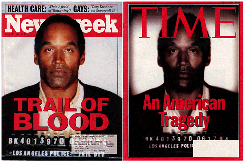
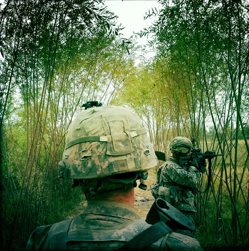
In par­tic­u­lar, we talk about this year’s win­ning world press photo by Paul Hansen. We also talk about using Insta­gram and Hip­st­matic style fil­ters in news pho­tog­ra­phy. We dis­cuss some famously ‘over’ manip­u­lated news images like the O.J. Simp­son Cover on Time Mag­a­zine back in 1994.  We also dis­cuss more sub­tle mod­ern ways in which dig­i­tal news images are manip­u­lated. Finally, we dis­cuss the fir­ing of the pho­to­jour­nal­ism staff at the Chicago Sun-Times.

Scroll to the BOTTOM of this post to find the player to imme­di­ately lis­ten to the audio podcast.

In 1994 Time and Newsweek used the same image of O.J. Simpson as the cover image. It's clear that Time magazine intentionally manipulated the image.

In 1994 Time and Newsweek used the same image of O.J. Simp­son on their cover. Our eyes can see that Time over-processed the image. Image from Wikipedia.

A Grunt's Life by Damon Winter - An award winning photo essay documenting a soldier's life taken using the Hipstamatic App on an iphone. The essay was originally published in The New York Times.

A Grunt’s Life by Damon Win­ter — An award win­ning photo essay doc­u­ment­ing a soldier’s life taken using the Hip­sta­matic App on an iphone. The essay was orig­i­nally pub­lished in The New York Times.

Alex Rodriguez - Instagram photo by Nick published in The New York Times.

Alex Rodriguez — Insta­gram photo by Nick Laham pub­lished in The New York Times.

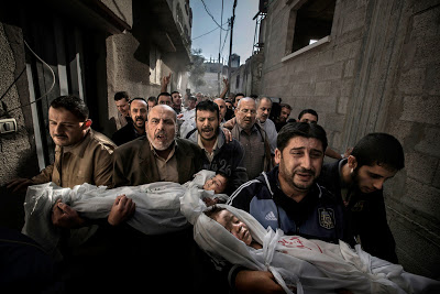
World Press Photo of the year 2013 - City Burial by Paul Hansen - Feb. 2013

World Press Photo of the year 2012 — City Bur­ial by Paul Hansen


Links /resources men­tioned in this pod­cast:
World Press Photo of the year (Large)
A Grunt’s Life — Damon Win­ter — The New York Times
From iPhone to printed page: The rise of Insta­gram in major pub­li­ca­tions
We Need Pho­to­jour­nal­ists — Arti­cle by SND.org
Carl Neustaedter on LinkedIN
A pet’s per­spec­tive — Low angled images — Photography.ca forum’s reg­u­lar assign­ment — June 2013
f/16 or smaller — Photography.ca forum’s level 2 assign­ment — June 2013

If you liked this pod­cast and want to review it on Itunes, this link gets you to the main page

If you are inter­ested in writ­ing for our blog please con­tact me photography.ca ( A T ) G m ail Dot co m (using stan­dard email formatting)

Please join the Photography.ca fan page on Facebook

My Face­book pro­file — Feel free to “friend” me — please just men­tion Photography.ca
My Twit­ter page — I will fol­low you if you fol­low me — Let’s con­nect — PLEASE email me and tell me who you are in case I don’t rec­i­p­ro­cate because I think you are a spammer.

If you are still lurk­ing on our forum,
feel free to join our friendly :)  Pho­tog­ra­phy forum

Thanks to Stephen, Dar­nell B, Dwayne and Royce How­land who posted a blog com­ment about our last pod­cast. Thanks as well to every­one that sent com­ments by email about our last pod­cast. Although ALL com­ments are appre­ci­ated, com­ment­ing directly in this blog is pre­ferred. Thanks as well to all the new mem­bers of the bul­letin board. Most of the links to actual the prod­ucts are affil­i­ate links that help sup­port this site. Thanks in advance if you pur­chase through those links.

If you are look­ing at this mate­r­ial on any other site except Photography.ca — Please hop on over to the Photography.ca blog and pod­cast and get this and other pho­tog­ra­phy info directly from the source. |Sub­scribe with iTunes|Sub­scribe via RSS feed |Sub­scribe with Google Reader|Sub­scribe for free to the Pho­tog­ra­phy pod­cast — Photography.ca and get all the posts/podcasts by Email

You can down­load this pho­tog­ra­phy pod­cast directly by click­ing the pre­ced­ing link or lis­ten to it almost imme­di­ately with the embed­ded player below.

Thanks for lis­ten­ing and keep on shooting!

World Press Photo of the Year Was Manipulated — Does it Matter Anymore?

The World Press Photo is an Inter­na­tional non profit orga­ni­za­tion that runs a pres­ti­gious con­test that has been around since 1955. Every year they choose a win­ning pho­to­jour­nal­is­tic image from among thou­sands of entries from dif­fer­ent cat­e­gories and name a sin­gle image as World Press Photo of the Year.  Many of the past win­ning images are iconic photographs.

This year, the win­ning image called Gaza Bur­ial by Paul Hansen has under­gone a lot of con­tro­versy. Some are say­ing that the 2013 World Press photo of the year image is fake, that it is a com­pos­ite image and should be dis­qual­i­fied. Oth­ers are say­ing that the image is not a com­pos­ite image but is very manip­u­lated. Another ver­sion of the same image has been dis­cov­ered on Flickr which is only adding to this controversy.

World Press Photo denies that the image is a com­pos­ite but agrees that it was retouched with respect to both global and local color and tone.

Wel­come to the new pho­to­graphic world where real­ity is sub­jec­tively mas­saged by the pho­tog­ra­pher, even in pho­to­jour­nal­ism. If you think that this should not be the case, in the­ory I’ll tell you that I agree with you.

I’ll also tell you that cling­ing to these purist notions gets you nowhere and that the vast major­ity of qual­ity pho­tographs that I see today, in any and all pho­tog­ra­phy gen­res have been manip­u­lated in some way.

Even clas­sic pho­to­jour­nal­is­tic images have been manip­u­lated in the past. Tokomo Uemura in her Bath from the Min­i­mata series by Eugene Smith was bleached for exam­ple to make the whites whiter. But that was a black and white pho­to­graph. The aver­age per­son does not know how skin tones should ren­der in black and white so these images were more sub­tle in their manip­u­la­tion. Way eas­ier to spot unnat­ural look­ing colours in colour photojournalism.

Pho­tog­ra­phers them­selves are on the fence about what level of manip­u­la­tion they feel is accept­able in Pho­to­jour­nal­ism. Even for World Press Photo the line is grey. Accord­ing to one of the con­test rules which I could NOT find on their site (but is repeated on many other web­sites),  “con­tent of the image must not be altered. Only retouch­ing which con­forms to the cur­rently accepted stan­dards in the indus­try is allowed”.

And THAT my fel­low photo lovers is the prob­lem. “Accepted Indus­try stan­dards?” Are they for real?  There AREN’T any stan­dards any­more. They vary from news agency to news agency. Remem­ber manip­u­lated O.J. Simp­son pho­tos…That was nearly 20 years ago and it’s obvi­ously still going on daily.

In this case, the answer is very very very sim­ple. Clearly write out the stan­dards you expect for your par­tic­u­lar contest!!!!

Here are the two images in ques­tion. It’s likely obvi­ous to any­one that has been shoot­ing for a while that both of these images were mas­saged in pho­to­shop. I do not think the image is a com­pos­ite. But the colours of the faces in par­tic­u­lar do not look nat­ural. The light­ing does not look nat­ural. It has been mas­saged to draw atten­tion from one ele­ment in the image to another ele­ment. Doing this actively guides the viewer’s eye.

I do this type of active guid­ing all the time (lev­el­ling the image, selec­tive dodg­ing and burn­ing etc. ) in 99% of the images I make. I used to do it in the dark­room. It was part of my pho­tog­ra­phy edu­ca­tion — it was con­sid­ered an essen­tial part of cre­ative pho­tog­ra­phy. But I am not a photojournalist.

So what do you think? Was this photo (s) “too” manipulated?

Gaza City Burial by Paul Hansen - Nov 2012 from Hackerfactor.com

Gaza City Bur­ial by Paul Hansen — Nov 2012 from Hackerfactor.com


Gaza City Burial by Paul Hansen - Feb. 2013 from Hackerfactor.com

Gaza City Bur­ial by Paul Hansen — Feb. 2013 from Hackerfactor.com


Restrictions on Aperture — I Felt Restricted

Ten days or so ago I posted on Face­book that it was going to be an f/2.8 day (using large aper­tures) and a strange thing hap­pened —  it was quite unex­pected actu­ally. What hap­pened was that I found myself hand­cuffed — unable to shoot. This seemed strange to me because I’ve put restric­tions on myself for fun a few times in the past but never an aper­ture restric­tion. In the past it was shoot­ing with a spe­cific focal length or delib­er­ately using an extra-high ISO or shoot­ing with a spe­cific theme in mind.

But this aper­ture restric­tion was dif­fer­ent for me and in ret­ro­spect I can see why. It depends on what play­ground you hang out in. If you are mainly a por­trait per­son, you shoot cre­ative por­traits wide open; that’s cool and fun…but it’s eas­ier because there is already some guid­ance with regard to sub­ject mat­ter. But when you go out ‘just to shoot’ and you’ll shoot just about any­thing that’s visu­ally inter­est­ing, then it gets harder.

For some crazy rea­son I found myself search­ing for scenes that I felt were wor­thy of what f/2.8 can do bokeh wise. I was plac­ing this sin­gle aspect of the lens above all else and it was taint­ing my expe­ri­ence of look­ing for scenes to shoot. It was slow­ing me down and suck­ing from the joy of pho­tog­ra­phy for pure pleasure.

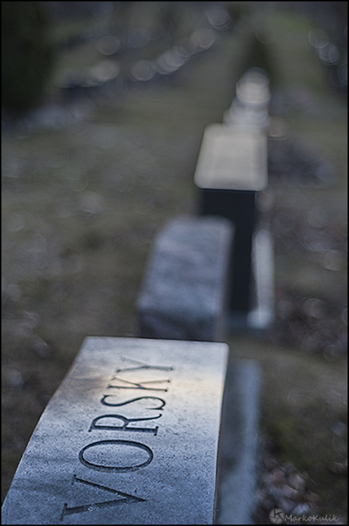
So for this rea­son — I didn’t like this par­tic­u­lar aper­ture restric­tion exer­cise even though I DO like the con­cept of restric­tion exer­cises in gen­eral. Maybe it’s also because I feel like I should have been able to over­come the restric­tion more eas­ily. Truth is, I really didn’t feel like I had any­thing of value on day 1. Then life gets busy and so I took a few days and waited more patiently for scenes where a large aper­ture seemed more appro­pri­ate. Here are a few that I liked. These were all taken near f/2.8 (I say near because I used a cou­ple of dif­fer­ent lenses whose largest aper­tures were near f/2.8).

Vorsky - ISO 200 f/1.8 1/100

Vorsky — ISO 200, f/1.8, 1/100

Beer Kitteh - ISO 3200 f/2.5 1/80

Belle Gueule — Beer Kit­teh — ISO 3200, f/2.5, 1/80

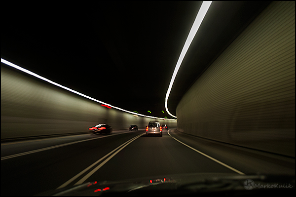
Not Recommended - ISO 200 f/2.8 0.3

Not Rec­om­mended — ISO 200, f/2.8, 0.3

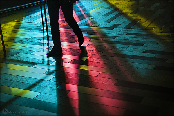
Light Trip - Palais Des Congres - Montreal - ISO 200 f/1.8 1/2500

Light Trip — Palais Des Con­gres — Mon­treal — ISO 200, f/1.8, 1/2500

Past Reflections - ISO 200 F/1.8 1/200

Past Reflec­tions — ISO 200, F/1.8, 1/200

117 — Noise Halos and Chromatic Aberration — Interview with Royce Howland

Pho­tog­ra­phy pod­cast #117 fea­tures an inter­view with fine art pho­tog­ra­pher Royce How­land where we dis­cuss the ‘junk’ that can get into our pho­tographs. In par­tic­u­lar we dis­cuss and dis­sect noise, halos and chro­matic aber­ra­tion in pho­tog­ra­phy. We talk about how to avoid get­ting these prob­lems, how to fix these prob­lems and how for some pho­tog­ra­phers — these aren’t prob­lems at all but rather, delib­er­ate cre­ative choices.

Royce does an AWESOME job of explain­ing these prob­lems so that they are under­stand­able to anyone. 

This is the longest pod­cast I’ve pub­lished to date and it clocks in at around 70 min­utes. We spend roughly 20 min­utes on each of the 3 top­ics. We cover halos first, then noise, then chro­matic aber­ra­tion. Each of the 3  issues have very dif­fer­ent causes and solutions.

Scroll to the BOTTOM of this post to find the player to imme­di­ately lis­ten to the audio podcast.

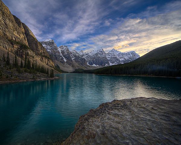
On the Rocks, Moraine Lake by Royce Howland

On the Rocks, Moraine Lake by Royce How­land — An HDR exam­ple where Royce con­trolled the set­tings to make sure no halos appeared in the sky or water.

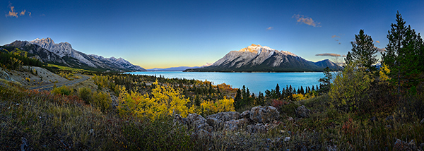
Fall at Abraham Lake by Royce Howland

Fall at Abra­ham Lake by Royce How­land — Another HDR exam­ple where Royce left the halo­ing in the sky, and in fact accen­tu­ated it a bit more via a Pho­to­shop Curves adjust­ment, to give a sense of glow over the moun­tains. So some­times halos are not a flaw, they’re a cre­ative choice.

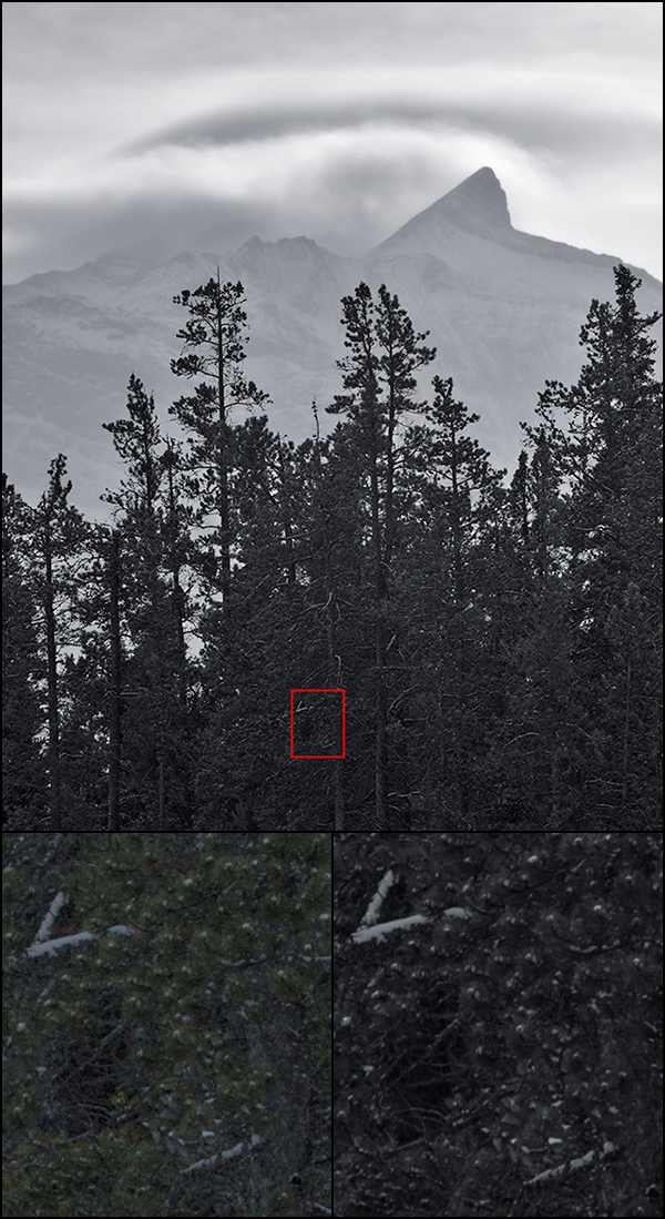
Looming, Abraham Lake by Royce Howland

Loom­ing, Abra­ham Lake by Royce How­land — An HDR exam­ple involv­ing a high con­trast back­lit scene. The trees were deeply shad­owed. Even on a Pen­tax 645D medium for­mat cam­era, there’s noise in those trees in a nor­mal sin­gle expo­sure. Bot­tom left — A 100% crop of a sin­gle expo­sure that went into the image above show­ing the level of noise in the trees. Bot­tom right — A 100% crop of the final image. Using a com­bi­na­tion of HDR tech­nique and a touch of addi­tional noise reduc­tion, I was able to sub­tly boost the con­trast in the deep shad­ows, pre­serve all of the gen­uine detail, and also vir­tu­ally elim­i­nate the dig­i­tal noise. With­out HDR tech­nique, just using a noise reduc­tion fil­ter can take the dig­i­tal noise down but gen­er­ally also will sac­ri­fice legit­i­mate detail as well.

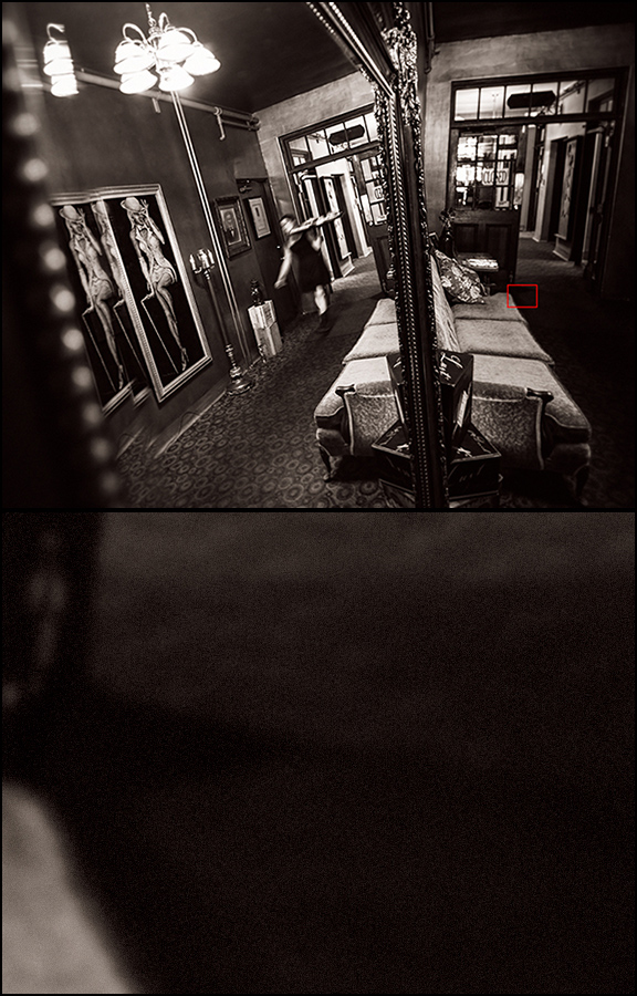
Ghost Of Server Present, Jerome by Royce Howland

Ghost Of Server Present, Jerome by Royce How­land — An indoor shot taken with avail­able light in some­what dim con­di­tions at a sup­pos­edly haunted hotel. I’m using a bunch of cre­ative tech­niques here includ­ing shal­low depth of field, a reflec­tion in a mir­ror, sub­ject motion blur and extra dig­i­tal blur­ring. Despite the soft­en­ing effects of all the tech­niques used in this image, I also wanted a bit of tex­ture and bit of “vin­tage film grain” feel. So far from remov­ing all dig­i­tal noise, I actu­ally con­trolled it and then added a uni­form mono­chro­matic grain layer on top of every­thing in Pho­to­shop. In print up to 16x20 size it’s dif­fi­cult to see this grain, but on a nice matte paper it gives a slight feel­ing of tex­ture; whereas run­ning noise reduc­tion as I would nor­mally do in fact makes the results look­ing flat and plas­tic. You can see the noise detail added in the bot­tom detailed part of the image.

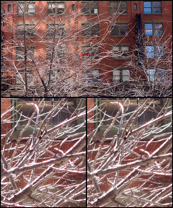
Chromatic aberration example at f/3.5 by Royce Howland

Chro­matic aber­ra­tion exam­ple at f/3.5 by Royce How­land — It was a bit after noon so the sun was high, and I shot straight into the light. The tree branches against a darker back­ground show extremely high con­trast edges. I was using a Sony RX100 pocket cam­era, which is a very high qual­ity point & shoot with a Carl Zeiss lens. So a qual­ity piece of kit for a com­pact. The first com­po­si­tion was at medium lens zoom and the aper­ture wide open — f/3.5. Bot­tom left — A 100% crop of the shot shows a lot of green and pur­ple fringes are vis­i­ble along the branch edges. Even towards the cen­ter of the lens, the chro­matic aber­ra­tion is pretty bad. This is a file con­verted from RAW using the lat­est Adobe Cam­era Raw in Pho­to­shop CS6, no chro­matic aber­ra­tion removal. Bot­tom right — Now here’s the iden­ti­cal file, but using the green and pur­ple fringe removal set­tings dur­ing RAW con­ver­sion. Quite strong set­tings were needed for the green fringes, not so strong for pur­ple. Mostly the fringes were removed.

Chromatic aberration example at f/5.6 by Royce Howland

Chro­matic aber­ra­tion exam­ple at f/5.6 by Royce How­land — Now here is the same com­po­si­tion pho­tographed again moments later in the same strong light, but stop­ping the lens down to f/5.6. Bot­tom left — Stop­ping the lens down just over 1 stop has actu­ally got­ten rid of many of the pur­ple & green fringes with­out doing any­thing else. That’s because a slightly smaller aper­ture lets through less of the mis­aligned light rays that con­tribute to the chro­matic aber­ra­tion in the first place. This is a RAW file con­verted again with no chro­matic aber­ra­tion set­tings. Bot­tom right — And here’s the same file con­verted with a small amount of pur­ple and green defringe set­tings, much less than needed in the first exam­ple and the results look better.


Links /resources men­tioned in this pod­cast:
Royce How­land Pho­tog­ra­phy
Photo real­is­tic HDR pod­cast with Royce How­land
Wikipedia Chro­matic Aber­ra­tion
DXO Optics
Topaz Denoise
Nik DFINE 2
Noise Ninja
PTLens
Emily Carr Images - She delib­er­ately painted in what we today call Halos. Shore­line, 1936 is an exam­ple.

If you liked this pod­cast and want to review it on Itunes, this link gets you to the main page

If you are inter­ested in writ­ing for our blog please con­tact me photography.ca ( A T ) G m ail Dot co m (using stan­dard email formatting)

Please join the Photography.ca fan page on Facebook

My Face­book pro­file — Feel free to “friend” me — please just men­tion Photography.ca
My Twit­ter page — I will fol­low you if you fol­low me — Let’s con­nect — PLEASE email me and tell me who you are in case I don’t rec­i­p­ro­cate because I think you are a spammer.

If you are still lurk­ing on our forum,
feel free to join our friendly :)  Pho­tog­ra­phy forum

Thanks to Jared Fein and Enrique Waizel who posted a blog com­ment about our last pod­cast. Thanks as well to every­one that sent com­ments by email about our last pod­cast. Although ALL com­ments are appre­ci­ated, com­ment­ing directly in this blog is pre­ferred. Thanks as well to all the new mem­bers of the bul­letin board. Most of the links to actual the prod­ucts are affil­i­ate links that help sup­port this site. Thanks in advance if you pur­chase through those links.

If you are look­ing at this mate­r­ial on any other site except Photography.ca — Please hop on over to the Photography.ca blog and pod­cast and get this and other pho­tog­ra­phy info directly from the source. |Sub­scribe with iTunes|Sub­scribe via RSS feed |Sub­scribe with Google Reader|Sub­scribe for free to the Pho­tog­ra­phy pod­cast — Photography.ca and get all the posts/podcasts by Email

You can down­load this pho­tog­ra­phy pod­cast directly by click­ing the pre­ced­ing link or lis­ten to it almost imme­di­ately with the embed­ded player below.

Thanks for lis­ten­ing and keep on shooting!

116 — Sharpness on Steroids — Focus stacking interview with Michael Breitung

Pho­tog­ra­phy pod­cast #116 fea­tures an inter­view with Ger­man land­scape pho­tog­ra­pher Michael Bre­itung where we talk about why and how to do focus stack­ing in pho­tog­ra­phy. Basi­cally focus stack­ing involves tak­ing mul­ti­ple frames of the same scene but each frame is focused at a dif­fer­ent part of the image. Then these frames are blended together using a graph­ics pro­gram like Gimp (free) or Pho­to­shop (expen­sive). The result is sharp­ness and depth of field on steroids that can’t be matched by any cam­era lens com­bi­na­tion on a 35mm DSLR cam­era at the time of this writ­ing.  Only tilt shift lenses can com­pete in this extreme sharp­ness arena, but those lenses require many saved dol­lars or a rich uncle. This tech­nique is free if you have the skills and a graph­ics program.

Scroll to the BOTTOM of this post to find the player to imme­di­ately lis­ten to the audio podcast.

Bloody Causeway - a focus stacked image by Michael Breitung

Bloody Cause­way by Michael Bre­itung — This focus stacked image blends 4 frames into one. Each frame was focused at a dif­fer­ent point and then blended in Pho­to­shop. Check out the sharp­ness from the clos­est cor­ners all the way to the end of the cause­way. This is sharp­ness swim­ming in awe­some sauce. The aper­ture used here was f/9.5


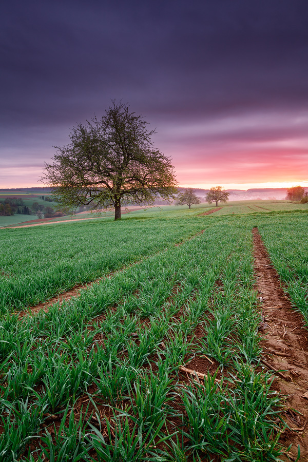
Kraichgau at Dawn - Focus stacked photograph by Michael Breitung

Kraich­gau at Dawn — Focus stacked pho­to­graph by Michael Breitung


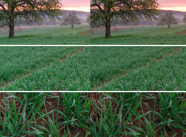
Kraichgau at Dawn - Close up comparison by Michael Breitung

Kraich­gau at Dawn Details — Close up com­par­i­son by Michael Bre­itung — Only 2 frames were needed to cre­ate the final full-sized image above this one. One frame (left) focused at the fore­ground cor­ners, gets the cor­ners sharp in the final image. The other frame (right) focused at the midground, gets both the midground and the back­ground sharp. Then the frames are blended in Pho­to­shop to pro­duce the final image. The aper­ture used here was f/11.


Links /resources men­tioned in this pod­cast:
Michael Bre­itung Pho­tog­ra­phy
Michael Breitung’s (advanced) start to fin­ish tuto­r­ial on his (Lightroom/Photoshop) post-processing work­flow and how he cre­ated the Bloody Cause­way image.
Heli­con Focus image stack­ing soft­ware
Zerene Stacker
Tilt shift lenses in land­scape pho­tog­ra­phy
March 2013 reg­u­lar Assign­ment — Wet or Rain
March 2013 level 2 Assign­ment — Dra­matic angles

If you liked this pod­cast and want to review it on Itunes, this link gets you to the main page

If you are inter­ested in writ­ing for our blog please con­tact me photography.ca (   A   T  ) G m ail  Dot co m (using stan­dard email formatting)

Please join the Photography.ca fan page on Facebook

My Face­book pro­file — Feel free to “friend” me — please just men­tion Photography.ca
My Twit­ter page — I will fol­low you if you fol­low me — Let’s con­nect — PLEASE email me and tell me who you are in case I don’t rec­i­p­ro­cate because I think you are a spammer.

If you are still lurk­ing on our forum,
feel free to join our friendly :)  Pho­tog­ra­phy forum

Thanks to D. Lavoie who posted a blog com­ment about our last pod­cast. Thanks as well to every­one that sent com­ments by email about our last pod­cast. Although ALL com­ments are appre­ci­ated, com­ment­ing directly in this blog is pre­ferred. Thanks as well to all the new mem­bers of the bul­letin board. Most of the links to actual the prod­ucts are affil­i­ate links that help sup­port this site. Thanks in advance if you pur­chase through those links.

If you are look­ing at this mate­r­ial on any other site except Photography.ca — Please hop on over to the Photography.ca blog and pod­cast and get this and other pho­tog­ra­phy info directly from the source. |Sub­scribe with iTunes|Sub­scribe via RSS feed |Sub­scribe with Google Reader|Sub­scribe for free to the Pho­tog­ra­phy pod­cast — Photography.ca and get all the posts/podcasts by Email
You can down­load this pho­tog­ra­phy pod­cast directly by click­ing the pre­ced­ing link or lis­ten to it almost imme­di­ately with the embed­ded player below.

Thanks for lis­ten­ing and keep on shooting!

Photoshop file exposure and exif data

When we are work­ing on our images in pro­grams like Pho­to­shop, some­times we for­get the expo­sure infor­ma­tion in the orig­i­nal file. We can also for­get many other use­ful bits of infor­ma­tion that are embed­ded in the file like did the flash fire, what focal length was used etc.

In Light­room and Bridge (comes free with Pho­to­shop) this Exif data is easy to find, the default pro­gram set­tings reveal this infor­ma­tion clearly.  Not so in Pho­to­shop where it is buried under the file menu (in Windows).

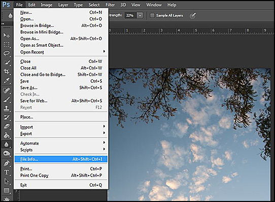
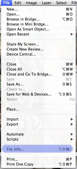
File — File info.… reveals the Exif data for any image you are work­ing on in Pho­to­shop. Click on the Cam­era Data tab to see the expo­sure information.

The key­board short cut (Win­dows) ALT + SHIFT + CTRL +I does the same thing.
The key­board short cut (Mac) OPTION + SHIFT + COMMAND +I does the same thing.

How to find exposure or exif data in Photoshop

How to find expo­sure or exif data in Pho­to­shop (This is a CS6 win­dows screenshot)


How to find exposure or exif data in Photoshop (This is a CS5 Mac screenshot)

How to find expo­sure or exif data in Pho­to­shop (This is a CS5 Mac screenshot)

115 — Color spaces — monitor settings — recommended hardware — Interview with Joe Brady

Pho­tog­ra­phy pod­cast #115 fea­tures an inter­view with Colour expert Joe Brady who works for Mac­group US.
Joe knows pretty much every­thing there is to know about get­ting accu­rate colour from your mon­i­tor and your printer. Joe has recorded 2 pod­casts with us already about mon­i­tor cal­i­bra­tion and those links are listed below in the shownotes. In this pod­cast, we tackle some colour con­cepts that are a source of con­fu­sion for many peo­ple. We talk about mon­i­tor set­tings like colour tem­per­a­ture, gamma, and lumi­nance. Then we tackle the sRGB, Adobe RGB and Prophoto RGB colour spaces and explain what they are, the advan­tages of each and when and where they are most use­ful. Finally, Joe rec­om­mends some cal­i­bra­tion tools, mon­i­tors and printers.

Scroll to the BOTTOM of this post to find the player to imme­di­ately lis­ten to the audio podcast.

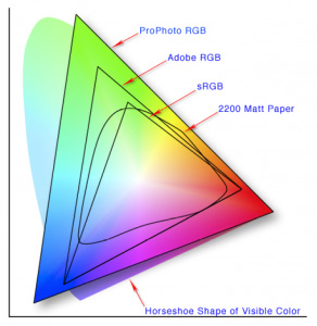
Color spaces in photography

This image shows off the 3 main color spaces. You’ll note that the ProPhoto RGB color space con­tains the most col­ors. This makes it the best color space for print­ing your own images on a qual­ity printer. When post­ing to the web, the colour space should be sRGB as that is the type of mon­i­tor that most peo­ple have.

Links /resources men­tioned in this pod­cast:
Pod­cast 62 – Mon­i­tor – printer cal­i­bra­tion – Inter­view with Joe Brady
Pod­cast 63 – Review of the Col­or­munki and the i1XTreme
Joe Brady Pho­tog­ra­phy
X-Rite Col­or­Munki Photo Color Man­age­ment Solu­tion at B&H
X-Rite Col­or­Munki Dis­play at B&H
Eizo FlexS­can SX2262W at B&H
Eizo Col­orEdge CG223W 22 at B&H

If you liked this pod­cast and want to review it on Itunes, this link gets you to the main page

If you are inter­ested in writ­ing for our blog please con­tact me photography.ca (   A   T  ) G m ail  Dot co m (using stan­dard email formatting)

Please join the Photography.ca fan page on Facebook

My Face­book pro­file — Feel free to “friend” me — please just men­tion Photography.ca
My Twit­ter page — I will fol­low you if you fol­low me — Let’s con­nect — PLEASE email me and tell me who you are in case I don’t rec­i­p­ro­cate because I think you are a spammer.

If you are still lurk­ing on our forum,
feel free to join our friendly :)  Pho­tog­ra­phy forum

Thanks to Mikey88  who posted a blog com­ment about our last pod­cast. Thanks as well to every­one that sent com­ments by email about our last pod­cast. Although ALL com­ments are appre­ci­ated, com­ment­ing directly in this blog is pre­ferred. Thanks as well to all the new mem­bers of the bul­letin board. Most of the links to actual the prod­ucts are affil­i­ate links that help sup­port this site. Thanks in advance if you pur­chase through those links.

If you are look­ing at this mate­r­ial on any other site except Photography.ca — Please hop on over to the Photography.ca blog and pod­cast and get this and other pho­tog­ra­phy info directly from the source. |Sub­scribe with iTunes|Sub­scribe via RSS feed |Sub­scribe with Google Reader|Sub­scribe for free to the Pho­tog­ra­phy pod­cast — Photography.ca and get all the posts/podcasts by Email
You can down­load this pho­tog­ra­phy pod­cast directly by click­ing the pre­ced­ing link or lis­ten to it almost imme­di­ately with the embed­ded player below.

Thanks for lis­ten­ing and keep on shooting!