67 — Orton Imagery — The Orton Effect — Interview with Michael Orton and Darwin Wiggett

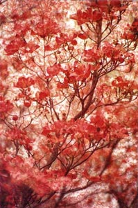
Pho­tog­ra­phy pod­cast #67 dis­cusses how to use Orton Imagery (AKA the Orton effect or the Orton Tech­nique) to give your pho­tographs an ethereal/painterly feel. This tech­nique was invented by Michael Orton in the mid 1980’s using 2 pieces of over­ex­posed slide film sand­wiched together. The prin­ci­ples of this tech­nique can also be used in graph­ics pro­grams like Pho­to­shop to achieve a sim­i­lar effect. This pod­cast con­tains 2 inter­views; one with Michael Orton dis­cussing‚ the technique’s his­tory, and one with Dar­win Wiggett,‚ dis­cussing his method for cre­at­ing Orton Imagery using Pho­to­shop and other graph­ics pro­grams. Darwin’s step-by-step is out­lined below and his Pho­to­shop action is also included. Thanks a ton Michael and Darwin!!

Image by Michael Orton - click to enlarge

Orton Imagery by Michael Orton — Click to enlarge

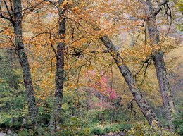
NMP2823 - Non-Orton image by Darwin Wiggett - Click to enlarge

NMP2823 — Non-Orton image by Dar­win Wiggett — Click to enlarge

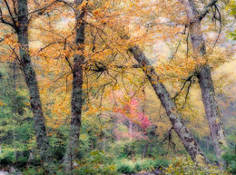
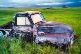
NMP2823 - Orton image by Darwin Wiggett - Click to enlarge

NMP2823 — Orton image by Dar­win Wiggett — Click to enlarge

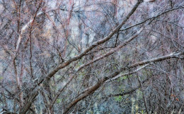
NMP9058 - Orton image by Darwin Wiggett - Click to enlarge

NMP9058 — Orton image by Dar­win Wiggett — Click to enlarge

NMP6435 - Orton image by Darwin Wiggett - Click to enlarge

NMP6435 — Orton image by Dar­win Wiggett — Click to enlarge

Here’s how to cre­ate Orton Imagery Using Pho­to­shop. Por­tion reprinted from from Orton Imagery — A …œHow to‚ guide for Pho­tog­ra­phers by Dar­win Wiggett. Thanks to Nature Pho­tog­ra­phers online mag­a­zine for allow­ing me to reprint this.

Dig­i­tal Tech­nique to Cre­ate Orton Images

Here, there are many ways to sim­u­late an Orton slide sand­wich. You can do it the same way as out­lined above for slides over­ex­pos­ing two sep­a­rate images and then in the com­puter stack­ing the images together in soft­ware and blend­ing them. Per­son­ally, I pre­fer to take my exist­ing dig­i­tized pho­tos (either from film scans or dig­i­tal cam­era files) and run­ning them through the process below to see if they work as …œOr­ton Images‚.

Here is the step-by-step recipe for mak­ing Orton images in Photoshop:

  1. Open any image you wish to try the tech­nique on. Make a dupli­cate of the image (Image>Duplicate). Close the orig­i­nal image.
  2. Lighten the image as fol­lows: Image>Apply Image‚¦ then in the dia­log box that comes up change the bend­ing mode to …œScreen‚ and the Opac­ity to 100%. This will give you an appro­pri­ately over­ex­posed image.
  3. Dupli­cate this over­ex­posed image (Image>Duplicate).
  4. Blur this sec­ond image (Filter>Blur>Gaussian Blur‚¦ and in the dia­log box use a Radius set­ting of 15 to 50 pix­els ‚” the higher the pixel set­ting the blur­rier the photo and the more ‹“painter­lyž the image‚¦ but you can go too far!). Exper­i­ment with dif­fer­ent set­tings, for my tastes and for the size of my dig­i­tal files (50–100 megabytes) a radius of about 25 pix­els works perfect.
  5. Now select the move tool from the Pho­to­shop tool bar (or just press …œv‚ on your key­board for quicker access to the move tool). Hold down the …œshift‚ key and use your mouse to drag and drop the blurry image onto the sharp one (donžt let go of the shift key until after you release the mouse but­ton or the images wonžt be in per­fect alignment).
  6. Bring up the lay­ers palette in Pho­to­shop (F7 is the key­board short­cut). Under the word …œLay­ers‚ in the lay­ers palette will be a menu box of blend­ing modes. Change the blend­ing mode from …œnor­mal‚ to …œmultiply‚.
  7. Now …œflat­tenž the two lay­ers by press­ing …œCTRL+E‚ or by click­ing on the side­ways tri­an­gle in the lay­ers palette to select ‹“flat­ten imagež.

There, you now have an Orton image — if you like your new mas­ter­piece save the file!

Copy­right Dar­win Wiggett and Nature Pho­tog­ra­phers Online Mag­a­zine — All rights reserved.
—————————————————————————————————

Dwayne Oaks from our pho­tog­ra­phy forum also lists the way he uses the Orton effect using NX2 soft­ware. Thanks Dwayne.
1-use mid­tone (lev­els) slider to brighten photo (2.04)
2-select gauss­ian blur, set radius slider to (15.85)px and opac­ity to (100)%
go to blend­ing mode and select (mul­ti­ply)
3-readjust (lev­els) slid­ers if nec­es­sary
4-in the case of my work to get the muted col­ors just turn down
the saturation

Links /resources men­tioned in this pod­cast:
More of Dar­win Wiggett’s work on Timecatcher.com
Pho­tograph­ing Cre­ative Land­scapes: Sim­ple Tools for Artis­tic Images and Enhanced Cre­ativ­ity by Michael Orton
Dances with Light by Dar­win Wiggett
Down­load Darwin’s Orton Action
June’s low shoot­ing angle assign­ment on the Photography.ca forum
See and vote on May 2009’s mem­ber images

If you are still lurk­ing on our forum,
feel free to join our friendly :) Pho­tog­ra­phy forum

Thanks as always to every­one that sent com­ments by email about our last pod­cast. Although ALL com­ments are appre­ci­ated, com­ment­ing directly in this blog is pre­ferred. Thanks as well to all the new mem­bers of the bul­letin board.

If you are look­ing at this mate­r­ial on any other site except Photography.ca — Please hop on over to the Photography.ca blog and pod­cast and get this and other pho­tog­ra­phy info directly from the source. I Sub­scribe with iTunes I Sub­scribe via RSS feed I Sub­scribe with Google Reader I Sub­scribe for free to the Pho­tog­ra­phy pod­cast — Photography.ca and get all the posts/podcasts by Email
You can down­load this pho­tog­ra­phy pod­cast directly by click­ing the pre­ced­ing link or lis­ten to it almost imme­di­ately with the embed­ded player below.

Removing Backgrounds from Images

So you’ve just taken the per­fect shot of a pair of shoes for a client. But wait… ooops. The client didn’t want the shoes to be on the table. So what can be done to remove the table? There are a few ways to go about it. First (and most obvi­ous) is to shoot the pair of shoes on a sim­ple back­drop with no distractions.


But if this is not pos­si­ble, Pho­to­shop can help you achieve that ‘near per­fect’ shoe shot by extract­ing it from the back­ground. Photoshop’s selec­tion tools work well to get the job done. The quick selec­tion tool is great for sim­ple extrac­tions. The back­ground eraser is another great tool. Although many peo­ple loved the extract tool in Pho­to­shop CS3, it’s miss­ing from CS4. (If you loved it and still have CS3, you can copy it from the CS3 Plug-ins-Filters folder to CS4).  But depend­ing on the sub­ject, these tools may miss out on some of the finer details like a model with frizzy hair. In cases like these, man­u­ally trac­ing the edges with the pen tool and then con­vert­ing it to a selec­tion is ideal. Tedious yes, but it will give you opti­mal results.

Plug­gins are also avail­able for remov­ing back­grounds if you’re up for the expense.
Who knew shoes could be so tech­ni­cal?!
Link from our Pho­tog­ra­phy forum

Removing Backgrounds from Images

So you’ve just taken the per­fect shot of a pair of shoes for a client. But wait… ooops. The client didn’t want the shoes to be on the table. So what can be done to remove the table? There are a few ways to go about it. First (and most obvi­ous) is to shoot the pair of shoes on a sim­ple back­drop with no distractions.


But if this is not pos­si­ble, Pho­to­shop can help you achieve that ‘near per­fect’ shoe shot by extract­ing it from the back­ground. Photoshop’s selec­tion tools work well to get the job done. The quick selec­tion tool is great for sim­ple extrac­tions. The back­ground eraser is another great tool. Although many peo­ple loved the extract tool in Pho­to­shop CS3, it’s miss­ing from CS4. (If you loved it and still have CS3, you can copy it from the CS3 Plug-ins-Filters folder to CS4).‚ But depend­ing on the sub­ject, these tools may miss out on some of the finer details like a model with frizzy hair. In cases like these, man­u­ally trac­ing the edges with the pen tool and then con­vert­ing it to a selec­tion is ideal. Tedious yes, but it will give you opti­mal results.

Plug­gins are also avail­able for remov­ing back­grounds if you’re up for the expense.
Who knew shoes could be so tech­ni­cal?!
Link from our Pho­tog­ra­phy forum

Composition in Photography

We all hear of cer­tain rules in pho­tog­ra­phy that one may want to abide by. It is not to say these rules are set in stone but if fol­lowed, nor­mally your pho­tos stand out that much more.


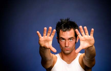
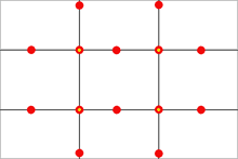
The ‘Rule of Thirds’ is used reg­u­larly by most advanced pho­tog­ra­phers. The rule states that an image should be imag­ined as divided into nine equal parts (like a tick tack toe board) by two equally-spaced hor­i­zon­tal lines and two equally-spaced ver­ti­cal lines, and that impor­tant com­po­si­tional ele­ments should be placed along these lines or their inter­sec­tions. The shot above is a good exam­ple. Most new­bies would have placed the model dead cen­ter in this image. The image works much bet­ter com­po­si­tion­al­ly  with the model to to right of cen­ter on one of the lines with the yel­low dot. Play with this ‘rule’ for your­self just to test it out.

Depth of Field (oth­er­wise known as DOF), is the area from the fore­ground to the back­ground within your photo that is in focus. A nar­row DOF (F-2.0 or F-2.8 for exam­ple) will allow the main sub­ject of your photo in be in focus while the back­ground is blurred. A wider DOF allows one’s eyes to wan­der over the whole image as there are more details that are in focus.

Other ‘rules’ to con­sider include lead­ing lines, fram­ing, fore­ground inter­est and more.

Orig­i­nal link from our Pho­tog­ra­phy forum

Composition in Photography

We all hear of cer­tain rules in pho­tog­ra­phy that one may want to abide by. It is not to say these rules are set in stone but if fol­lowed, nor­mally your pho­tos stand out that much more.


The ‘Rule of Thirds’ is used reg­u­larly by most advanced pho­tog­ra­phers. The rule states that an image should be imag­ined as divided into nine equal parts (like a tick tack toe board) by two equally-spaced hor­i­zon­tal lines and two equally-spaced ver­ti­cal lines, and that impor­tant com­po­si­tional ele­ments should be placed along these lines or their inter­sec­tions. The shot above is a good exam­ple. Most new­bies would have placed the model dead cen­ter in this image. The image works much bet­ter com­po­si­tion­ally‚ with the model to to right of cen­ter on one of the lines with the yel­low dot. Play with this ‘rule’ for your­self just to test it out.

Depth of Field (oth­er­wise known as DOF), is the area from the fore­ground to the back­ground within your photo that is in focus. A nar­row DOF (F-2.0 or F-2.8 for exam­ple) will allow the main sub­ject of your photo in be in focus while the back­ground is blurred. A wider DOF allows one’s eyes to wan­der over the whole image as there are more details that are in focus.

Other ‘rules’ to con­sider include lead­ing lines, fram­ing, fore­ground inter­est and more.

Orig­i­nal link from our Pho­tog­ra­phy forum

How to Create Sepia Tones

To add a cer­tain nos­tal­gic effect to pho­tos, many fine art pho­tog­ra­phers‚ enjoy chang­ing the colour of the pho­to­graph or actu­ally ton­ing the print to sepia. Using the dark­room to achieve your sepia effect is an option if you have the facil­i­ties avail­able. If not, you have two other options — an in cam­era option on many DSLRs and good old photoshop.

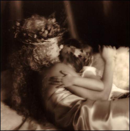
This image was printed in the darkroom and then toned in a sepia bath to get this rich brown colour.

Venus and Cupid by Marko Kulik — This image was printed in the dark­room and then toned in a sepia bath to get this rich brown colour.


Many dig­i­tal cam­eras now offer you the option of tak­ing the image in sepia (and other tones as well like blue, red, green etc.) This is quick and effi­cient for imme­di­ate results. It does have it’s lim­i­ta­tions though, like los­ing all of the colour infor­ma­tion in the image. This is why most pho­tog­ra­phers like to ‘play around’ with their photo in photoshop.

Pho­to­shop not only allows the option of con­vert­ing to sepia, but it fur­ther allows a whole range of brown/orange tones to choose from. Some artists pre­fer a more muted sepia, while oth­ers pre­fer it to appear more dras­tic. Either way, there is really a vast array of tones to choose from.

What­ever the method, just make sure of one thing — save an orig­i­nal copy of your photo just in case you decide that sepia wasn’t for you after all.

Here’s the link from our Pho­tog­ra­phy forum

66 — Becoming a Photography Assistant

Pho­tog­ra­phy pod­cast #66 dis­cusses how to become a photographer’s assis­tant and this topic was sug­gested by new bul­letin board mem­ber Ray. Thanks Ray!‚ Becom­ing a pho­tog­ra­phy assis­tant is a great way to learn how pho­tog­ra­phy is done in the ‘real world’ with real world pres­sures. It is a great way to decide if being a pro­fes­sional pho­tog­ra­pher is really what you want to do. This pod­cast sug­gests some good ways to get your foot in the door. If vis­i­tors read­ing this have addi­tional ideas, leav­ing a com­ment would be most appreciated.

Links men­tioned in this pod­cast:
May’s Nos­tal­gia assign­ment on the Photography.ca forum
See and vote on April 2009’s mem­ber images
Pho­tog­ra­phy jobs (dif­fer­ent USA list­ings — some for pho­tog­ra­phy assistants)

If you are still lurk­ing on our forum,
feel free to join our friendly :) Pho­tog­ra­phy forum

Thanks as always to every­one that sent com­ments by email about our last pod­cast. Although ALL com­ments are appre­ci­ated, com­ment­ing directly in this blog is pre­ferred. Thanks as well to all the new mem­bers of the bul­letin board.

If you are look­ing at this mate­r­ial on any other site except Photography.ca — Please hop on over to the Photography.ca blog and pod­cast and get this and other pho­tog­ra­phy info directly from the source. I Sub­scribe with iTunes I Sub­scribe via RSS feed I Sub­scribe with Google Reader I Sub­scribe for free to the Pho­tog­ra­phy pod­cast — Photography.ca and get all the posts/podcasts by Email
You can down­load this pho­tog­ra­phy pod­cast directly by click­ing the pre­ced­ing link or lis­ten to it almost imme­di­ately with the embed­ded player below.

Photography.ca winning member images from April 2009

For the past few months we have added a new fea­ture on our pho­tog­ra­phy bul­letin board where the Admin on Photography.ca (Me, Marko), chooses 1 photo that he thinks is great and talks about the photo. The pen­guin photo below titled A zoo more by Siejones was my choice for this month. (check the pre­vi­ous link for the explanation).

We have lots of pho­tographs being sub­mit­ted each month on our forum for cri­tiques, assign­ments or just to show the photo. Choos­ing Siejones’s photo as the ‹“win­nerž took many hours of care­ful sift­ing. Given that it took so long to choose, I came across many many many close con­tenders. Seems like a waste of time just to include 1 photo so Ižd like to include 4 hon­ourable men­tions right here.

If you havenžt joined our forum I would encour­age you to do so. We are an extremely friendly bunch that share and learn daily.

Herežs the win­ning photo by Siejones:

A zoo more by Siejones


Here are the 4 hon­ourable men­tions in no par­tic­u­lar order:

A Mallard’s Por­trait by Michaelaw

A Walk On Deck by Lovin

Cloud bank BW by Barefoot

Gui­tarist by AcadieLibre

Cameras and Manual Mode

Using Man­ual Mode on your cam­era… daunt­ing to most new­bie pho­tog­ra­phers, but a gem once you know how to use it.

Many new­bie pho­tog­ra­phers steer clear away from Man­ual mode, and Opt for Auto­matic mode instead.‚ Full ‘Auto’ mode chooses every­thing from your ISO, to your shut­ter speed and aper­ture includ­ing whether or not a flash should be used. So really, it gives you a safety net to assure you can grab that shot with­out muff­ing it up. That said, the shot you end up with is based on the CAMERA’s choices not the photographer’s choices.


Man­ual mode how­ever allows you to set both your aper­ture and shut­ter speed sep­a­rately, with­out the cam­era auto­mat­i­cally chang­ing the other to suit. With this in mind, you can be more cre­ative with your shots, and in turn, you can bet­ter under­stand how to get that per­fect shot.

Man­ual mode seems to take more time then, right? Right.

But as a result, it forces you to THINK about your sub­ject at hand, learn about light, shut­ter speed, depth of field and work at per­fect­ing your shot and your craft.

PHOTOGRAPHY FORUM LINK

Shooting good portraits

The per­fect por­trait doesn’t exist because there is always some­one that won’t like it ;)
That said, there are a few basic tips that can help you get more inter­est­ing and more flat­ter­ing portraits.


~ Watch which way your light­ing is com­ing in and check the qual­ity of the light. Softer dif­fused light is a much bet­ter light for flat­ter­ing por­traits than harsh direct light. Although back­light is amaz­ing for dra­matic inter­est­ing por­traits, it’s harder to work with espe­cially for some­one newer to pho­tog­ra­phy. Using front light, side­light, and 3/4 light along with fill light from a sec­ondary flash‚ or reflec­tor will bring your por­trait skills up a notch.
~ Adjust your aper­ture so that the back­ground blurs out a bit and more focus is placed on your sub­ject.
~ Alter your per­spec­tive by tak­ing the shot from a dif­fer­ent angle rather than eye level. This can really change the ‘wow’ fac­tor of your photo.
~‚ Play with eye con­tact — it does won­ders to a pho­to­graph when your subject’s focus is on some­thing else.

Shoot­ing the per­fect por­trait may seem daunt­ing, but keep­ing use­ful tips in mind when doing so will make por­trait pho­tog­ra­phy a ‘snap’.

More tips can be found at: http://www.photography.ca/Forums/showthread.php?t=2393