Vintage photo of the day Jan. 17, 2011

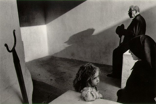
The vin­tage photo of the day is from the series Por­tu­gal by Mas­ter Czech pho­tog­ra­pher Josef Koudelka and was taken in 1976. Koudelka is well known for his work pho­tograph­ing Gyp­sies in Slo­va­kia and Roma­nia as well as cap­tur­ing the daily‚interactions‚of peo­ple from many dif­fer­ent (mostly) Euro­pean countries.

Joseph Koudelka - Portugal - 1976

Joseph Koudelka — Por­tu­gal — 1976

What attracts us to this image is the sense of story com­bined with bril­liant com­po­si­tion. I don’t know what the story is here but it’s a drama. Older man waits in back­ground with a shad­owed pro­file over­look­ing a pri­vate con­ver­sa­tion. The woman is smil­ing in pro­file, per­haps try­ing to soothe or coax the young girl, and the child is con­cerned. What is hap­pen­ing to her? For me, this scene is filled with tension.

Com­po­si­tion­ally, this image is a master-class. Angu­lar lines add to the ten­sion in the image. Tri­an­gles (our eyes love‚triangles) are every­where . Cor­ners, angled light rays, noses, table ends, knee bends, elbows are just a few of the tri­an­gles that we see. Look harder and you’ll see more of them…it’s no acci­dent that they are there. Even the inter­ac­tion (both obvi­ous and sub­tle) between the 3‚individuals‚is tri­an­gu­lar. Some fine black and white print­ing with a rich assort­ment of tones further‚adds to this image’s impact.
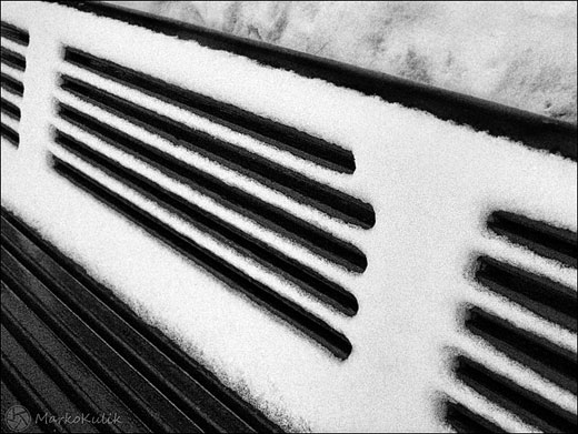
Photo of the day Jan. 13, 2011

Win­ter is a great time to cap­ture black and whites because most of the colours are cov­ered in snow. ‚It’s also a great time to shoot lines and pat­terns for the same rea­son; the lack of colour empha­sizes their forms. The lines, angles and con­trast caught my eye when I spot­ted this bench and I was happy to have the G11 with me. This was a tricky shot because it was later in the day (less light) and I was hold­ing ‚a loaf of bread and a pie in the other hand as I shot this. While this was on the screen I knew that I’d likely pre­fer the shot if it were flipped as it would make it more abstract.

Bench Lines - ‚© Marko Kulik

Bench Lines — ‚© Marko Kulik

92 — My damn lenses keep vignetting — solving vignetting problems

Pho­tog­ra­phy pod­cast #92 talks about solv­ing vignetting which is the unwanted dark­en­ing around the edges or cor­ners in your pho­tographs. We talk about 2–3 very com­mon rea­sons why even pro­fes­sional lenses that cost a for­tune, STILL suf­fer from vignetting in cer­tain cases. ‚We also talk about why many peo­ple never notice the vignetting in their pho­tographs even though it’s often there.

Mechanical or filter vignetting

This is mechan­i­cal vignetting of a shot of the sky on my F2.8 24mm wide angle lens and is due to too many fil­ters in front of the lens. Shot at left at F2.8. Stop­ping down to F 5.6 (right shot) ‚helps slightly. A bet­ter solu­tion here is to sim­ply use less fil­ters, or wider ones.

Optical vignetting

Opti­cal vignetting on neu­tral sub­ject. Shot at left is at F-5.6 focused on infin­ity using the 300mm end of my 28–300 zoom. Shot at right is at F-11 focused on infin­ity using the 300mm end of my 28–300 zoom‚and the vignetting is almost gone. Both images shot with­out fil­ters of any kind. This type of vignetting can occur in some cases on almost any DSLR lens regard­less of price.‚Listening‚to the pod­cast explains why this happens.

Links /resources men­tioned in this podcast:

Cam­bridge in Colour arti­cle on lenses
Wider Cokin Z fil­ter hold­ers at B&H
Step up rings at B&H
Adapter rings at B&H
Emo­tion is the reg­u­lar assign­ment this month on our pho­tog­ra­phy forum
Back­light­ing is the level 2 assign­ment this month on our pho­tog­ra­phy forum

Please join the Photography.ca fan page on Facebook

If you liked this pod­cast and want to review it on Itunes, this link gets you to the main page

My Face­book pro­file — Feel free to “friend” me — please just men­tion Photography.ca
My Twit­ter page — I will fol­low you if you fol­low me — Let’s con­nect — PLEASE email me and tell me who you are in case I don’t rec­i­p­ro­cate because I think you are a spammer.

If you are still lurk­ing on our forum,
feel free to join our friendly :)Pho­tog­ra­phy forum

Thanks to Jack Label and Sevenwords‚who posted a blog com­ment about our last pod­cast. Thanks as always to every­one that sent com­ments by email about our last pod­cast. Although ALL com­ments are appre­ci­ated, com­ment­ing directly in this blog is pre­ferred. Thanks as well to all the new mem­bers of the bul­letin board. Most of the links to actual the prod­ucts are affil­i­ate links that help sup­port this site. Thanks in advance if you pur­chase through those links.

If you are look­ing at this mate­r­ial on any other site except Photography.ca — Please hop on over to the‚Photography.ca blog and pod­cast and get this and other pho­tog­ra­phy info directly from the source. |Sub­scribe with iTunes |Sub­scribe via RSS feed |Sub­scribe with Google Reader |Sub­scribe for free to the Pho­tog­ra­phy pod­cast — Photography.ca and get all the posts/podcasts by Email
You can down­load this pho­tog­ra­phy pod­cast directly by click­ing the pre­ced­ing link or lis­ten to it almost imme­di­ately with the embed­ded player below.

Happy New Year every­one and only the best for 2011 — thanks for lis­ten­ing and keep on shooting!

Vintage photo of the day Jan. 8, 2011

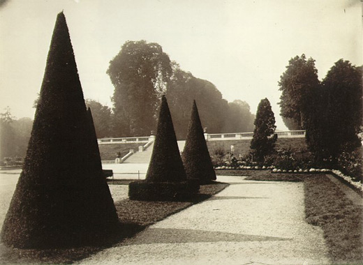
The vin­tage photo of the day is called Saint-Cloud (a sub­urb of Paris, France) by Eugene Atget and was taken in the early 1920’s. Atget is well known for for doc­u­ment­ing the land­scape, urban­scape, parks and street scenes and of ” Old” Paris‚in the late 1800’s and early part of the twen­ti­eth century.

Saint-Cloud by Eugene Atget 1921-1922

Saint-Cloud by Eugene Atget 1921–1922

Although newer pho­tog­ra­phers might look at this image and go “meh”, there’s actu­ally lots of inter­est­ing stuff to look at due to the care­ful com­po­si­tion. The repeat­ing cone-shaped trees and their shad­ows are the focal points of the image and their shapes are some­what repeated by the other trees in the back­ground. Great use of lead­ing lines and shapes cre­ated in both the pos­i­tive and neg­a­tive areas of this pho­to­graph make it far more intrigu­ing than it ini­tially seems.

The‚George‚Eastman‚house also has quite a good col­lec­tion of Atget pho­tographs for those that want to see more of this Master’s work.

http://www.geh.org/fm/atget/htmlsrc/atget_sld00001.html

Photography forum image of the month – December 2010

Every month on our pho­tog­ra­phy forum mem­bers nom­i­nate images that they like. Then at the end of the month I choose an excel­lent image and talk about why it rocks. The photo I choose is not nec­es­sar­ily the best one of the month. I’ve come to real­ize it’s not really log­i­cal to pit images from totally dif­fer­ent gen­res against each other. That’s why there are cat­e­gories in photo con­tests. I just choose a photo that has extremely strong ele­ments that we can learn from.

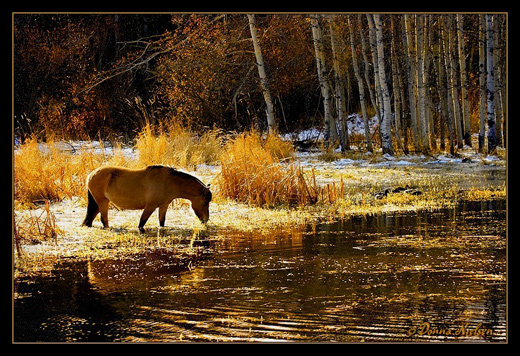
Golden Glitter by Donna

Golden Glit­ter by Donna

This month’s choice is Golden Glit­ter by Donna

I chose this image for sev­eral reasons:

Com­po­si­tion — I just love the com­po­si­tion here, it’s so pleas­ing to the eye. The rule of thirds is work­ing well for me here with approx­i­mately 1/3 fore­ground, 1/3 midground and 1/3 back­ground when you look hor­i­zon­tally. When you look ver­ti­cally it’s a clas­sic 1/3rd left and 2/3rds to the right. Some peo­ple scoff at the rule of thirds.…scoff away…if the horse were cen­tered here, the image would not be as visu­ally inter­est­ing. The horse was likely delib­er­ately cap­tured in an excel­lent spot which is the bright­est spot in the image. Our eye goes right to the horse. The water line in the midground is another inter­est­ing element.

Colour palette/tonal qual­ity — These are WOW colours for me even though they are quite con­trasty in parts of the image. The colour palette is golden warm, well bal­anced, and the tones are harmonious.

Lighting/exposure — This is tricky light­ing which means tricky expo­sure and it is very well han­dled. The backlighting/sidelighting on the horse has just enough detail on its side to make it inter­est­ing and pro­vide a bit of reflec­tion in the water. The head is par­tially sil­hou­et­ted which adds drama and grabs our eye as pre­vi­ously mentioned.

For all these rea­sons, this is my choice for image of the month. Since we all have opin­ions, some mem­bers may dis­agree with my choice. That’s cool but THIS thread is not the place for debate over my pick, NOR is it the place to fur­ther cri­tique the image. The pur­pose here is to sug­gest strong ele­ments in the photo that we may learn from.

Con­grats again Donna for cap­tur­ing this gor­geous scene!

Photography forum image of the month December 2010

Every month on ourpho­tog­ra­phy forum mem­bers nom­i­nate images that they like. Then at the end of the month I choose an excel­lent image and talk about why it rocks. The photo I choose is not nec­es­sar­ily the best one of the month. I’ve come to real­ize it’s not really log­i­cal to pit images from totally dif­fer­ent gen­res against each other. That’s why there are cat­e­gories in photo con­tests. I just choose a photo that has extremely strong ele­ments that we can learn from.

Golden Glitter by Donna

Golden Glit­ter by Donna

This month’s choice is‚Golden Glit­ter by Donna

I chose this image for sev­eral reasons:

Com­po­si­tion — I just love the com­po­si­tion here, it’s so pleas­ing to the eye. The rule of thirds is work­ing well for me here with approx­i­mately 1/3 fore­ground, 1/3 midground and 1/3 back­ground when you look hor­i­zon­tally. When you look ver­ti­cally it’s a clas­sic 1/3rd left and 2/3rds to the right. Some peo­ple scoff at the rule of thirds.…scoff away…if the horse were cen­tered here, the image would not be as visu­ally inter­est­ing. The horse was likely delib­er­ately cap­tured in an excel­lent spot which is the bright­est spot in the image. Our eye goes right to the horse. The water line in the midground is another inter­est­ing element.

Colour palette/tonal qual­ity — These are WOW colours for me even though they are quite con­trasty in parts of the image. The colour palette is golden warm, well bal­anced, and the tones are harmonious.

Lighting/exposure — This is tricky light­ing which means tricky expo­sure and it is very well han­dled. The backlighting/sidelighting on the horse has just enough detail on its side to make it inter­est­ing and pro­vide a bit of reflec­tion in the water. The head is par­tially sil­hou­et­ted which adds drama and grabs our eye as pre­vi­ously mentioned.

For all these rea­sons, this is my choice for image of the month. Since we all have opin­ions, some mem­bers may dis­agree with my choice. That’s cool but THIS thread is not the place for debate over my pick, NOR is it the place to fur­ther cri­tique the image. The pur­pose here is to sug­gest strong ele­ments in the photo that we may learn from.

Con­grats again Donna for cap­tur­ing this gor­geous scene!

Vintage photo of the day Jan. 3, 2011

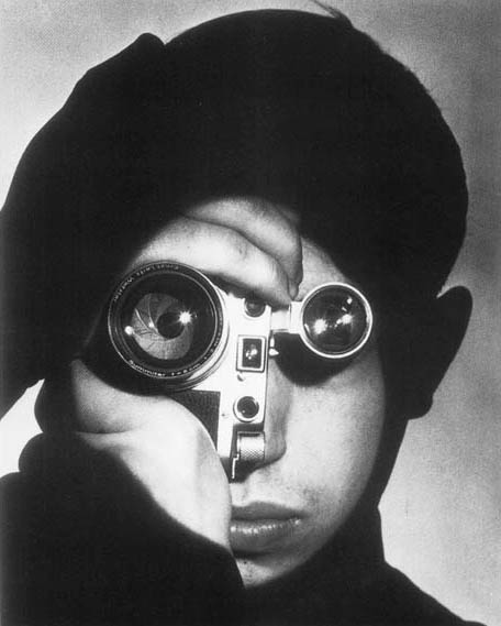
Today’s vin­tage photo of the day is called The Pho­to­jour­nal­ist by Andreas Feininger and was taken in 1951. It has become an iconic por­trait and the sub­ject is pho­to­jour­nal­ist David Stock who won a pho­to­jour­nal­ism com­pe­ti­tion. Feininger shot the image‚for Life Mag­a­zine where he worked for decades.

Feininger is per­haps best known for his‚architectural‚ and street shots of New York City in the for­ties and fifties. This por­trait does not rep­re­sent Feininger’s aver­age sub­ject mat­ter and yet it is amongst his most famous pho­tographs for many good reasons.

The Photojournalist by Andreas Feininger - 1951

The Pho­to­jour­nal­ist by Andreas Feininger — 1951

What draws us to this pho­to­graph is obvi­ously the unique way it’s pre­sented. The Leica cam­era is turned to one side so that the lens and viewfinder act as the subject’s eyes. Both lenses have spec­u­lar high­lights which mimic the catch­lights seen in por­traits. In addi­tion, the image is beau­ti­fully printed with rich blacks and whites with detail. The eye is skill­fully guided to the focal points (lens and viewfinder) in this image, likely through selec­tive dodg­ing and burn­ing (selec­tive dark­en­ing and light­en­ing of spe­cific parts of the image). It’s the com­bi­na­tion of tech­ni­cal skill and well thought out com­po­si­tion that make this image superb.

Photo of the day – Dec. 30, 2010

A friend of mine is mov­ing out of his place with a great view of Down­town Mon­treal in 2 days so I was lucky enough to get one last crack to shoot a night scene.  As it hap­pens there’s also some­thing called Spheres Polaires in town and the spheres add to the image.

Montreal Night Scene - Marko Kulik

Mon­treal Night Scene — Marko Kulik

Vintage photo of the day — Dec. 27, 2010

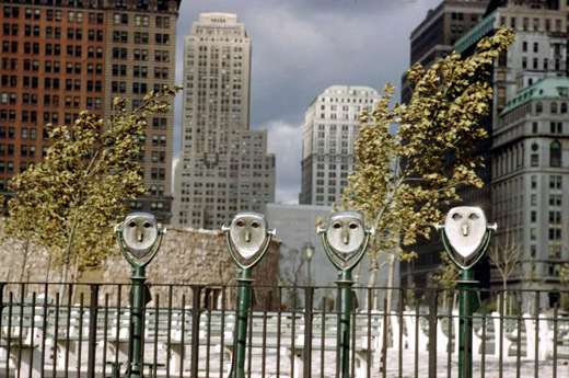
Today’s vin­tage pho­to­graph of the day by mas­ter pho­tog­ra­pher Ernst Haas, is titled Binoc­u­lars and it was taken in Bat­tery Park, NY in 1952. Haas is well known for adopt­ing colour early on in his career before many of his con­tem­po­raries. Famous Haas colour pho­tographs include slow motion studies.

A Haas quote that I really dig is, “The best pic­tures dif­fer­en­ti­ate them­selves by nuances‚¦a tiny rela­tion­ship ‚ either a har­mony or a dishar­mony — that cre­ates a picture.”

Binoculars by Ernst Haas - 1952

Binoc­u­lars by Ernst Haas — 1952

This pho­to­graph works on‚multiple‚levels which is likely why it works so well.
The‚binoculars‚themselves look like human faces so we are‚immediately‚attracted to that aspect. How­ever, other ele­ments also make this image inter­est­ing. These ele­ments include the fence and the build­ings in the back­ground. For me, the fence, binoc­u­lars and back­ground build­ings rep­re­sent the fact that ‘mak­ing it’ in New York is dif­fi­cult. The fence sep­a­rates you from the build­ings but you can see them through the binoc­u­lars. Get­ting there, is a battle…but if you can make it there, you can make it anywhere.

91 — 3 ways to reduce noise in photography

Pho­tog­ra­phy pod­cast #91 dis­cusses 3 common‚reasons‚we get noise in our pho­tographs and we offer tips on how to beat that noise. For the pur­poses of this pod­cast, noise is the appear­ance of coloured‚specks, ‚monochromatic‚specks or bands/lines that appear in your pho­tographs (often in uni­form areas like the sky or in the shad­owy parts of the image) that should not be there.

Scene from Oka Parc Quebec Canada

Scene from Oka Park Que­bec Canada

This image from OKA Park looks pleas­ing enough and look­ing at it here you might not know that the image was under­ex­posed. I boosted the lev­els in Pho­to­shop so at first glance it looks pretty good.

HOWEVER, this 100% crop from the same image reveals the noise (colours in the snow) due to underexposure.

Snow detail crop at 100% shows colour noise

Snow detail crop at 100% shows colour noise

TIP — Don’t auto­mat­i­cally under­ex­pose. Under­ex­pose the scene only when necessary.

Links /resources men­tioned in this podcast:

Cam­bridge in Colour arti­cle on noise
Noise Ninja
Dfine
Topaz Denoise

Shiny‚is the reg­u­lar assign­ment this month on our pho­tog­ra­phy forum
Ton sur Ton is the level 2 assign­ment this month on our pho­tog­ra­phy forum

Please join the Photography.ca fan page on Facebook

If you liked this pod­cast and want to review it on Itunes, this link gets you to the main page

My Face­book pro­file — Feel free to “friend” me — please just men­tion Photography.ca
My Twit­ter page — I will fol­low you if you fol­low me — Let’s con­nect — PLEASE email me and tell me who you are in case I don’t rec­i­p­ro­cate because I think you are a spammer.

If you are still lurk­ing on our forum,
feel free to join our friendly :) Pho­tog­ra­phy forum

Thanks to rabs, Lee Sacrey, Las Vegas Wed­dings, Charles binns land­scape pho­tog­ra­phy, and Michael Van der Tol who posted a blog com­ment about our last pod­cast. Thanks as always to every­one that sent com­ments by email about our last pod­cast. Although ALL com­ments are appre­ci­ated, com­ment­ing directly in this blog is pre­ferred. Thanks as well to all the new mem­bers of the bul­letin board. Most of the links to actual the prod­ucts are affil­i­ate links that help sup­port this site. Thanks in advance if you pur­chase through those links.

If you are look­ing at this mate­r­ial on any other site except Photography.ca — Please hop on over to the‚Photography.ca blog and pod­cast and get this and other pho­tog­ra­phy info directly from the source. |Sub­scribe with iTunes |Sub­scribe via RSS feed |Sub­scribe with Google Reader |Sub­scribe for free to the Pho­tog­ra­phy pod­cast — Photography.ca and get all the posts/podcasts by Email
You can down­load this pho­tog­ra­phy pod­cast directly by click­ing the pre­ced­ing link or lis­ten to it almost imme­di­ately with the embed­ded player below.

Happy Hol­i­days every­one and only the best for 2011 — thanks for lis­ten­ing and keep on shooting!