Photography forum image of the month November 2011

Every month on our pho­tog­ra­phy forum mem­bers nom­i­nate images that they like. Then at the end of the month I choose an excel­lent image and talk about why it rocks. The photo I choose is not nec­es­sar­ily the best one of the month. I’ve come to real­ize it’s not really log­i­cal to pit images from totally dif­fer­ent gen­res against each other. That’s why there are cat­e­gories in photo con­tests. I just choose a photo that has extremely strong ele­ments that we can learn from.

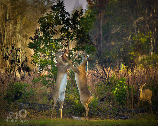
Fight Club! by Lizardqing

Fight Club! by Lizardqing


This month’s choice is (click to see the larger ver­sion of this image) Fight Club! by Lizardqing

I chose this image for sev­eral reasons:

1 — Timing/Decisive moment. You gotta have a quick trig­ger fin­ger to catch a moment like this or you will miss it. We’ve all missed fab oppor­tu­ni­ties like this, or mis­framed oppor­tu­ni­ties like this; good on Lizardquing for this fab capture.

2 — Com­po­si­tion — I really like the com­po­si­tion here. It is espe­cially impres­sive given the speed needed to catch this image. I really like the faun at the right side as well as the posi­tion of the trees.

3 — Exposure/lighting/colour — Expo­sure looks very good here and could eas­ily have been missed given the light­ing. Good choice of shutter-speed to keep things fairly sharp but still reveal motion in the deers’ front legs. Lovely colour palette as well. The light­ing is won­der­ful in this image, good on Lizardqing for being there early enough to capture.

For all these rea­sons, this is my choice for image of the month. Since we all have opin­ions, some mem­bers may dis­agree with my choice. That’s cool but THIS thread is not the place for debate over my pick, NOR is it the place to fur­ther cri­tique the image. The pur­pose here is to sug­gest strong ele­ments in the photo that we may learn from.

Con­grats again Lizardqing for cap­tur­ing this won­der­ful moment!

Photography forum image of the month October 2011

Every month on our pho­tog­ra­phy forum mem­bers nom­i­nate images that they like. Then at the end of the month I choose an excel­lent image and talk about why it rocks. The photo I choose is not nec­es­sar­ily the best one of the month. I’ve come to real­ize it’s not really log­i­cal to pit images from totally dif­fer­ent gen­res against each other. That’s why there are cat­e­gories in photo con­tests. I just choose a photo that has extremely strong ele­ments that we can learn from.

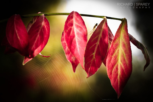
Autumn Web by Richard

Autumn Web by Richard

This month’s choice is (click to see the larger ver­sion of this image)  Autumn Web by Richard

I chose this image for sev­eral reasons:

1 — Plan­ning and exe­cu­tion — This strik­ing image is the result of plan­ning, it didn’t “just hap­pen” and it wasn’t a quick snap. The light­ing, comp and post-processing are all well thought out here. The result is a strik­ing moody fall image.

2 — Com­po­si­tion — details — post­pro­cess­ing — Lovely ren­dered details like the spi­der as well as the spider’s web all con­tribute to the com­po­si­tion here. Spi­der is framed nicely between the red leaves and against the back­light. The post­pro­cess­ing includ­ing the vignette and pos­si­ble selec­tive sharp­en­ing are guid­ing our eyes thought­fully with­out distractions.

3 — Light­ing — Mood — Back­light­ing is a chal­leng­ing light to deal with, but Richard bal­ances it well with off cam­era flash. The end result is an image with a lovely mood that would likely have felt too dark with­out the added light.

4 — Selec­tive focus — A wide aper­ture is well used here to get the dreamy back­ground bokeh. It adds another ‘layer’ to the image.

For all these rea­sons, this is my choice for image of the month. Since we all have opin­ions, some mem­bers may dis­agree with my choice. That’s cool but THIS thread is not the place for debate over my pick, NOR is it the place to fur­ther cri­tique the image. The pur­pose here is to sug­gest strong ele­ments in the photo that we may learn from.

Con­grats again Richard for cre­at­ing this strik­ing image!

Photography forum image of the month August 2011

Every month on our pho­tog­ra­phy forum mem­bers nom­i­nate images that they like. Then at the end of the month I choose an excel­lent image and talk about why it rocks. The photo I choose is not nec­es­sar­ily the best one of the month. I’ve come to real­ize it’s not really log­i­cal to pit images from totally dif­fer­ent gen­res against each other. That’s why there are cat­e­gories in photo con­tests. I just choose a photo that has extremely strong ele­ments that we can learn from.

My Lit­tle Friend by Wicked Dark

This Month’s choice is  (click to see the large ver­sion of this image) My Lit­tle Friend by Wicked Dark.

I chose this image for sev­eral reasons:

Sharp­ness — It’s dif­fi­cult to get this level of sharp­ness when doing macro work and the sharp­ness on the crawler here is won­der­ful and very strik­ing! On the oppo­site end the back­ground out of focus ele­ments also work well to iso­late the pri­mary subject.

Com­po­si­tion — All eyes are on the bug here and this is due to good com­po­si­tion with almost no dis­trac­tions. The curved part of the crawler is well seen due to the comp and the diag­o­nal branch at right act as a frame and helps keep our eyes on the most impor­tant element.

Colour/Lighting — The image busts with colour due to shoot­ing in softer light along with some (likely) pro­cess­ing to enhance the greens.

For all these rea­sons, this is my choice for image of the month. Since we all have opin­ions, some mem­bers may dis­agree with my choice. That’s cool but THIS thread is not the place for debate over my pick, NOR is it the place to fur­ther cri­tique the image. The pur­pose here is to sug­gest strong ele­ments in the photo that we may learn from.

Con­grats again Wicked Dark for cap­tur­ing this strik­ing crawler.

Photography forum image of the month July 2011

Every month on our pho­tog­ra­phy forum mem­bers nom­i­nate images that they like. Then at the end of the month I choose an excel­lent image and talk about why it rocks. The photo I choose is not nec­es­sar­ily the best one of the month. I’ve come to real­ize it’s not really log­i­cal to pit images from totally dif­fer­ent gen­res against each other. That’s why there are cat­e­gories in photo con­tests. I just choose a photo that has extremely strong ele­ments that we can learn from.

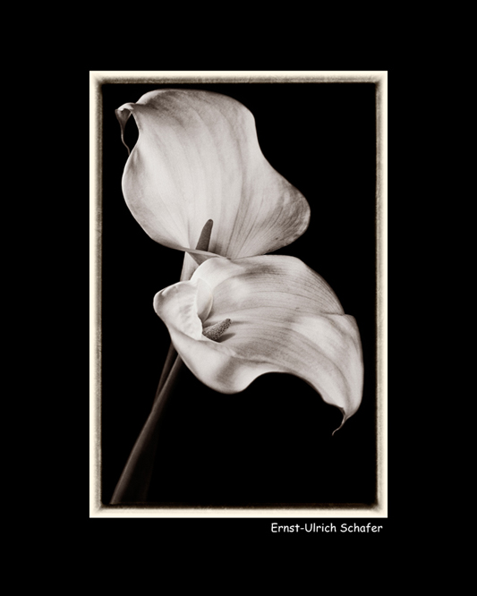
Today’s Calla Lil­lies by Ernst Ulrich-Schafer

This month’s choice is Today’s Calla Lil­lies by Ernst Ulrich-Schafer.

I chose this image for sev­eral reasons:

Com­po­si­tion — Com­po­si­tion here is very pleas­ing to the eye! Diag­o­nal stems from bot­tom left guide the eye to the focal point of the image which are the flow­ers’ inte­ri­ors. The shapes of the flow­ers them­selves are won­der­ful and won­der­fully placed in the image. The flow­ers even cre­ate quite an inter­est­ing neg­a­tive space due the con­trast against a black background.

Light­ing and Post-processing — Lovely light­ing here shows off the flow­ers very well. The light­ing is soft­ish but doesn’t look over­soft. Shad­ows are well con­trolled here with the deep­est blacks being the back­ground itself. This helps the flow­ers “pop” big-time against that back­ground. Post-processing is also well done here with lovely details in the whites. If I have one nit, I’d nix the black frame as this changes the over­all per­spec­tive of the flow­ers mak­ing them look smaller. That said, I know Ernst put it there 100% on pur­pose and it works for him.

Tonal qual­ity — I really like the mono­chrome (light sepia to my eye) qual­ity of this image. Mono­chrome really helps show off the strong shapes of these flow­ers, as well as give them a nos­tal­gic feel.

For all these rea­sons, this is my choice for image of the month. Since we all have opin­ions, some mem­bers may dis­agree with my choice. That’s cool but THIS thread is not the place for debate over my pick, NOR is it the place to fur­ther cri­tique the image. The pur­pose here is to sug­gest strong ele­ments in the photo that we may learn from.

Con­grats again Ernst Ulrich-Schafer for cre­at­ing this won­der­ful image!

Photography forum image of the month June 2011

Every month on our pho­tog­ra­phy forum mem­bers nom­i­nate images that they like. Then at the end of the month I choose an excel­lent image and talk about why it rocks. The photo I choose is not nec­es­sar­ily the best one of the month. I’ve come to real­ize it’s not really log­i­cal to pit images from totally dif­fer­ent gen­res against each other. That’s why there are cat­e­gories in photo con­tests. I just choose a photo that has extremely strong ele­ments that we can learn from.

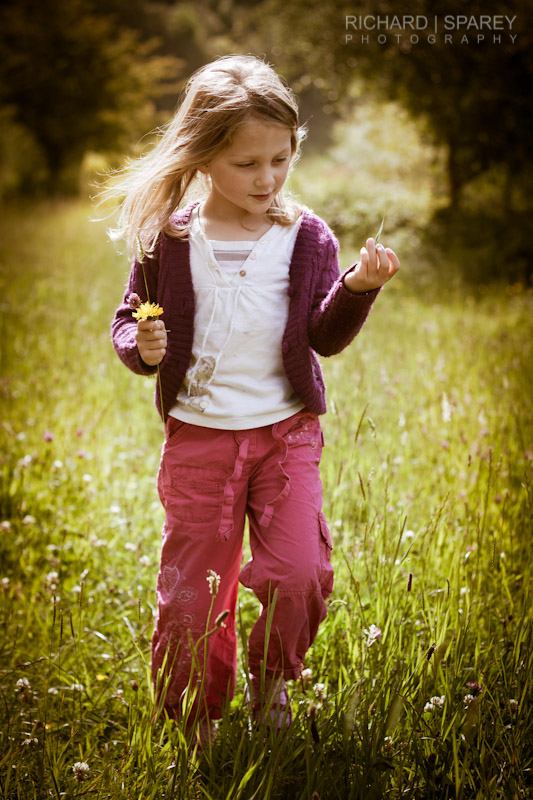
Flower Pick­ing at Ast­bury Mere by Richard

This month’s choice is Flower Pick­ing at Ast­bury Mere by Richard

I chose this image for sev­eral reasons:

Gesture/Mood — The over­all ‘ges­ture’ is beau­ti­fully cap­tured in this image. Richard cap­tured his daugh­ter in mid-step while walk­ing through nature play­ing with a leaf and a flower. It feels as though she may have been day­dream­ing; in fact the whole image has a day­dreamy qual­ity due in good part to the ‘ges­ture’ and won­der­ful backlighting.

Post-Processing — The (PP) post-processing here works very well to sup­port the image. I really like the vignetting all around the girl as it empha­sizes the girl’s walk through a field of flow­ers and sunshine.

Selec­tive focus — Shal­low depth of field is clas­si­cally used to have the girl stand out against the dreamy background.

Lighting/exposure — Back­light­ing was well cho­sen here as the light is quite harsh but the image doesn’t have a very harsh feel. The girl’s face looks well exposed and appears com­fort­able and nat­ural because the sun is not blast­ing it directly. The spec­u­lar high­lights on the hair, hand and around the cloth­ing are won­der­ful warm accents and do not distract.

For all these rea­sons, this is my choice for image of the month. Since we all have opin­ions, some mem­bers may dis­agree with my choice. That’s cool but THIS thread is not the place for debate over my pick, NOR is it the place to fur­ther cri­tique the image. The pur­pose here is to sug­gest strong ele­ments in the photo that we may learn from.

Con­grats again Richard for see­ing and cap­tur­ing this won­der­ful photo!

Photography forum image of the month May 2011

Every month on our pho­tog­ra­phy forum mem­bers nom­i­nate images that they like. Then at the end of the month I choose an excel­lent image and talk about why it rocks. The photo I choose is not nec­es­sar­ily the best one of the month. I’ve come to real­ize it’s not really log­i­cal to pit images from totally dif­fer­ent gen­res against each other. That’s why there are cat­e­gories in photo con­tests. I just choose a photo that has extremely strong ele­ments that we can learn from.

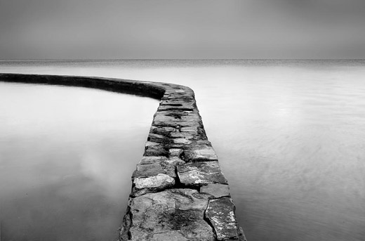
Lake Wall by taffy

Lake Wall by taffy

This month’s choice is Lake Wall by taffty.

I chose this image for sev­eral reasons:

Mood — The over­all mood here (which I inter­pret as as “ethe­real”) is cre­ated by many fac­tors includ­ing; the soft light, the com­po­si­tion and of course the black and white post pro­cess­ing. The whitish clouds reflect­ing in the water as well as what looks to be a really gen­tle surf also give you the feeling/illusion that the wall is float­ing on air.

Com­po­si­tion — The lines, curves, shapes, sub-shapes cre­ated by the lines and curves, and the use of neg­a­tive space are all well used here. They please our eyes and intrigue our eyes. The curved wall-path that starts with medium/light tones in the fore­ground to darker at left midground leads our eye beau­ti­fully as it ‘cuts’ through the lighter tones on the left..

Expo­sure and post pro­cess­ing — Both well han­dled here. Even though the light is soft, reflec­tions off the water make for a trick­ier expo­sure. Whites hold their sub­tle detail on my mon­i­tor and I like that. Sil­very mid­tones in the sky (back­ground) and imme­di­ate fore­ground match each other for won­der­ful effect.

For all these rea­sons, this is my choice for image of the month. Since we all have opin­ions, some mem­bers may dis­agree with my choice. That’s cool but THIS thread is not the place for debate over my pick, NOR is it the place to fur­ther cri­tique the image. The pur­pose here is to sug­gest strong ele­ments in the photo that we may learn from.

Con­grats again taffy for see­ing and and cre­at­ing this won­der­ful photo!

Photography forum image of the month April 2011

Every month on our pho­tog­ra­phy forum mem­bers nom­i­nate images that they like. Then at the end of the month I choose an excel­lent image and talk about why it rocks. The photo I choose is not nec­es­sar­ily the best one of the month. I’ve come to real­ize it’s not really log­i­cal to pit images from totally dif­fer­ent gen­res against each other. That’s why there are cat­e­gories in photo con­tests. I just choose a photo that has extremely strong ele­ments that we can learn from.

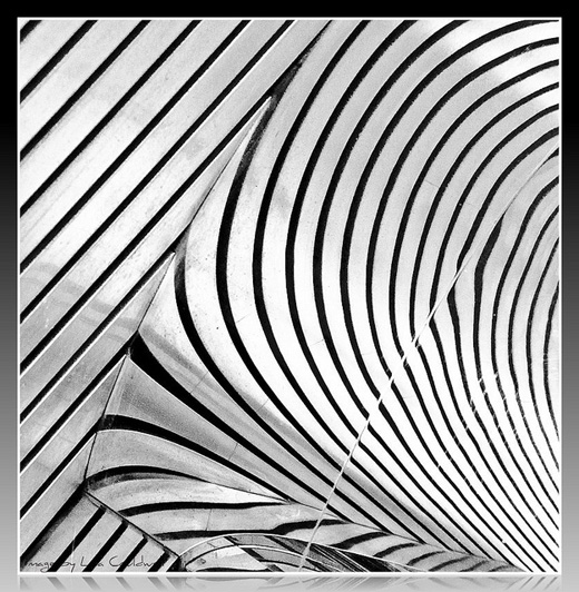
Repetition in Monochrome by Casil403

Rep­e­ti­tion in Mono­chrome by Casil403

This month’s choice is Rep­e­ti­tion in Mono­chrome by casil403.

I chose this image for sev­eral reasons:

Spot­ting the scene — Abstracts like this are often all around us, and the vast major­ity of us will never ever see them. Look­ing is not the same as see­ing. See­ing takes longer, it takes more time and more patience. Hats off to Casil for see­ing this fab­u­lous abstract.

Com­po­si­tion — Even though we are not sure what we are look­ing at, this abstract scene is very well com­posed and very delib­er­ate. Both the curved lines and the straight lines in this image intrigue and suc­cess­fully guide our eye through the image. The repet­i­tive qual­ity of the curves and lines is also very pleas­ing. In case peo­ple are won­der­ing what the abstract actu­ally is, Casil wrote …“it’s the reflec­tion of a sof­fit ceil­ing on a mir­rored pole.”

Post pro­cess­ing — Black and white was an excel­lent choice for this scene. The lack of colour empha­sizes the graphic qual­ity of the lines and pat­terns that we see. The tonal qual­ity of the scene (good rep­re­sen­ta­tion of tones) as well as the frame around the scene suits this image extremely well.

For all these rea­sons, this is my choice for image of the month. Since we all have opin­ions, some mem­bers may dis­agree with my choice. That’s cool but THIS thread is not the place for debate over my pick, NOR is it the place to fur­ther cri­tique the image. The pur­pose here is to sug­gest strong ele­ments in the photo that we may learn from.

Con­grats again Casil for see­ing, cap­tur­ing and pro­cess­ing this won­der­ful find!

Photography forum image of the month March 2011

Every month on our pho­tog­ra­phy forum mem­bers nom­i­nate images that they like. Then at the end of the month I choose an excel­lent image and talk about why it rocks. The photo I choose is not nec­es­sar­ily the best one of the month. I’ve come to real­ize it’s not really log­i­cal to pit images from totally dif­fer­ent gen­res against each other. That’s why there are cat­e­gories in photo con­tests. I just choose a photo that has extremely strong ele­ments that we can learn from.

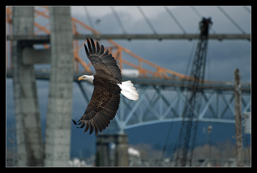
Urban Eagle by Michaelaw

Urban Eagle by Michaelaw

This month’s choice is Urban Eagle by Michaelaw.

I chose this image for sev­eral reasons:

Story and com­po­si­tion — The title Urban Eagle tells it all and the awe­some back­ground imagery of a bridge and cranes make the story more com­pelling. Themes and sub­themes abound in shots like this and I really enjoy that. The eagle is well posi­tioned in this shot that had to be com­posed super-quickly. The back­ground ele­ments (bridge struc­ture and cranes) are also very well placed in the shot.

Degree of dif­fi­culty — timing/decisive moment — This is no easy shot to get. The tim­ing, (just look at the lovely frozen open-wings) the focus, and com­po­si­tion have to be very well synced and Michaelaw did an excel­lent job.

Sharp­ness — The bird’s feath­ers are really sharp and the eye looks quite sharp along with some lovely back­ground bokeh.

Colour and post pro­cess­ing — Both are well con­trolled to cre­ate this very strik­ing image with a lovely ‘cool’ colour palette that totally suits the image. If it were my shot I may have burned in the rear white wings a bit and dodged the face a wee bit but that’s it.

For all these rea­sons, this is my choice for image of the month. Since we all have opin­ions, some mem­bers may dis­agree with my choice. That’s cool but THIS thread is not the place for debate over my pick, NOR is it the place to fur­ther cri­tique the image. The pur­pose here is to sug­gest strong ele­ments in the photo that we may learn from.

Con­grats again Michaelaw for cap­tur­ing this won­der­ful scene!

Photography forum image of the month February 2011

Every month on our pho­tog­ra­phy forum mem­bers nom­i­nate images that they like. Then at the end of the month I choose an excel­lent image and talk about why it rocks. The photo I choose is not nec­es­sar­ily the best one of the month. I’ve come to real­ize it’s not really log­i­cal to pit images from totally dif­fer­ent gen­res against each other. That’s why there are cat­e­gories in photo con­tests. I just choose a photo that has extremely strong ele­ments that we can learn from.

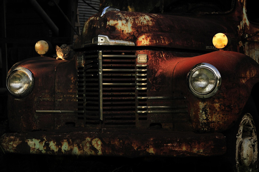
Junk Yard Cat by Barefoot

Junk Yard Cat by Barefoot

This month’s choice is Junk Yard Cat by Barefoot

I chose this image for sev­eral reasons:

Mood — Light­ing — This image has a great mood due to the won­der­ful light­ing. The light­ing is on the low key side and it’s totally work­ing for me here. Even though the light­ing is low-keyish there’s still quite a bit of deli­cious shadow detail.

Good sug­ges­tion of a story — This is also related to the mood but it looks to me like this car is in an old garage or barn. The car is also way old with loads of rust but it still serves a pur­pose, it’s not dead yet. It serves as a poten­tial favourite rest­ing spot for the cat.

Sub­tlety — Mys­tery — Sur­prise — I love the fact that my eye did NOT go straight to the cat in this shot and this is due to the fact that the bright cir­cu­lar thing on top of the head­light at right is the first thing we look at. I love that. Had the cat been brighter, the shot would have been more about the cat and our eye would have gone straight for the cat. This way, we get a bet­ter sur­prise when we notice the cat.

Com­po­si­tion — I dig the repeat­ing cir­cles and lines in this image as well as the point of view from which the image was taken.

For all these rea­sons, this is my choice for image of the month. Since we all have opin­ions, some mem­bers may dis­agree with my choice. That’s cool but THIS thread is not the place for debate over my pick, NOR is it the place to fur­ther cri­tique the image. The pur­pose here is to sug­gest strong ele­ments in the photo that we may learn from.

Con­grats again Bare­foot for see­ing and cap­tur­ing this won­der­ful scene!

Photography forum image of the month January 2011

Every month on our pho­tog­ra­phy forum mem­bers nom­i­nate images that they like. Then at the end of the month I choose an excel­lent image and talk about why it rocks. The photo I choose is not nec­es­sar­ily the best one of the month. I’ve come to real­ize it’s not really log­i­cal to pit images from totally dif­fer­ent gen­res against each other. That’s why there are cat­e­gories in photo con­tests. I just choose a photo that has extremely strong ele­ments that we can learn from.

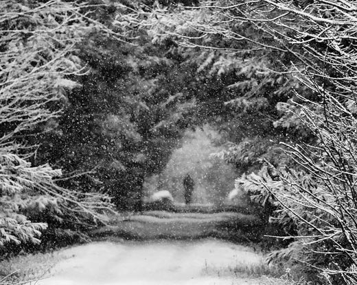
A snowy morning by Bambi

A snowy morn­ing by Bambi

This month’s choice is‚A snowy morn­ing by Bambi

I chose this image for sev­eral reasons:

Mood — This image has a won­der­ful mood and this mood is cre­ated by the falling snow, the snow cov­ered branches in the fore­ground against the darker toned trees in the midground and of course the fig­ure in the back­ground. A shal­lower depth of field with the sharpest ele­ments in the fore­ground might not have been the obvi­ous choice for many pho­tog­ra­phers, but it is rock­ing this image big-time! The shut­ter speed catch­ing the sus­pended snow is also help­ing the mood. The Black and white con­ver­sion is very well done, and it suits and enhances the other ele­ments con­tribut­ing to the over­all mood.

Com­po­si­tion — Very well done here! There are ‘lay­ers’ of inter­est­ing things for our eyes to look at start­ing from the fore­ground and con­tin­u­ing to the back­ground where the focal point (the per­son) is. Our eye is well guided through this win­tery ‘tunnel’.

Exposure/shutter speed — Both are well han­dled here. The shut­ter speed ‘freezes‚ ’ the falling snow here. A good expo­sure keeps the whites in check and offers up won­der­ful tonal­ity with a good range of tones. If I have 1 teeny nig­gle I might burn in the light­est branches at top right by maybe 5%.

For all these rea­sons, this is my choice for image of the month. Since we all have opin­ions, some mem­bers may dis­agree with my choice. That’s cool but THIS post is not the place for debate over my pick, NOR is it the place to fur­ther cri­tique the image. The pur­pose here is to sug­gest strong ele­ments in the photo that we may learn from.

Con­grats again Bambi for cap­tur­ing this gor­geous scene!

Photography forum image of the month December 2010

Every month on ourpho­tog­ra­phy forum mem­bers nom­i­nate images that they like. Then at the end of the month I choose an excel­lent image and talk about why it rocks. The photo I choose is not nec­es­sar­ily the best one of the month. I’ve come to real­ize it’s not really log­i­cal to pit images from totally dif­fer­ent gen­res against each other. That’s why there are cat­e­gories in photo con­tests. I just choose a photo that has extremely strong ele­ments that we can learn from.

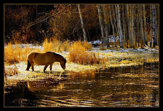
Golden Glitter by Donna

Golden Glit­ter by Donna

This month’s choice is‚Golden Glit­ter by Donna

I chose this image for sev­eral reasons:

Com­po­si­tion — I just love the com­po­si­tion here, it’s so pleas­ing to the eye. The rule of thirds is work­ing well for me here with approx­i­mately 1/3 fore­ground, 1/3 midground and 1/3 back­ground when you look hor­i­zon­tally. When you look ver­ti­cally it’s a clas­sic 1/3rd left and 2/3rds to the right. Some peo­ple scoff at the rule of thirds.…scoff away…if the horse were cen­tered here, the image would not be as visu­ally inter­est­ing. The horse was likely delib­er­ately cap­tured in an excel­lent spot which is the bright­est spot in the image. Our eye goes right to the horse. The water line in the midground is another inter­est­ing element.

Colour palette/tonal qual­ity — These are WOW colours for me even though they are quite con­trasty in parts of the image. The colour palette is golden warm, well bal­anced, and the tones are harmonious.

Lighting/exposure — This is tricky light­ing which means tricky expo­sure and it is very well han­dled. The backlighting/sidelighting on the horse has just enough detail on its side to make it inter­est­ing and pro­vide a bit of reflec­tion in the water. The head is par­tially sil­hou­et­ted which adds drama and grabs our eye as pre­vi­ously mentioned.

For all these rea­sons, this is my choice for image of the month. Since we all have opin­ions, some mem­bers may dis­agree with my choice. That’s cool but THIS thread is not the place for debate over my pick, NOR is it the place to fur­ther cri­tique the image. The pur­pose here is to sug­gest strong ele­ments in the photo that we may learn from.

Con­grats again Donna for cap­tur­ing this gor­geous scene!

Photography forum image of the month – December 2010

Every month on our pho­tog­ra­phy forum mem­bers nom­i­nate images that they like. Then at the end of the month I choose an excel­lent image and talk about why it rocks. The photo I choose is not nec­es­sar­ily the best one of the month. I’ve come to real­ize it’s not really log­i­cal to pit images from totally dif­fer­ent gen­res against each other. That’s why there are cat­e­gories in photo con­tests. I just choose a photo that has extremely strong ele­ments that we can learn from.

Golden Glitter by Donna

Golden Glit­ter by Donna

This month’s choice is Golden Glit­ter by Donna

I chose this image for sev­eral reasons:

Com­po­si­tion — I just love the com­po­si­tion here, it’s so pleas­ing to the eye. The rule of thirds is work­ing well for me here with approx­i­mately 1/3 fore­ground, 1/3 midground and 1/3 back­ground when you look hor­i­zon­tally. When you look ver­ti­cally it’s a clas­sic 1/3rd left and 2/3rds to the right. Some peo­ple scoff at the rule of thirds.…scoff away…if the horse were cen­tered here, the image would not be as visu­ally inter­est­ing. The horse was likely delib­er­ately cap­tured in an excel­lent spot which is the bright­est spot in the image. Our eye goes right to the horse. The water line in the midground is another inter­est­ing element.

Colour palette/tonal qual­ity — These are WOW colours for me even though they are quite con­trasty in parts of the image. The colour palette is golden warm, well bal­anced, and the tones are harmonious.

Lighting/exposure — This is tricky light­ing which means tricky expo­sure and it is very well han­dled. The backlighting/sidelighting on the horse has just enough detail on its side to make it inter­est­ing and pro­vide a bit of reflec­tion in the water. The head is par­tially sil­hou­et­ted which adds drama and grabs our eye as pre­vi­ously mentioned.

For all these rea­sons, this is my choice for image of the month. Since we all have opin­ions, some mem­bers may dis­agree with my choice. That’s cool but THIS thread is not the place for debate over my pick, NOR is it the place to fur­ther cri­tique the image. The pur­pose here is to sug­gest strong ele­ments in the photo that we may learn from.

Con­grats again Donna for cap­tur­ing this gor­geous scene!