Shooting good portraits

The per­fect por­trait doesn’t exist because there is always some­one that won’t like it ;)
That said, there are a few basic tips that can help you get more inter­est­ing and more flat­ter­ing portraits.


~ Watch which way your light­ing is com­ing in and check the qual­ity of the light. Softer dif­fused light is a much bet­ter light for flat­ter­ing por­traits than harsh direct light. Although back­light is amaz­ing for dra­matic inter­est­ing por­traits, it’s harder to work with espe­cially for some­one newer to pho­tog­ra­phy. Using front light, side­light, and 3/4 light along with fill light from a sec­ondary flash‚ or reflec­tor will bring your por­trait skills up a notch.
~ Adjust your aper­ture so that the back­ground blurs out a bit and more focus is placed on your sub­ject.
~ Alter your per­spec­tive by tak­ing the shot from a dif­fer­ent angle rather than eye level. This can really change the ‘wow’ fac­tor of your photo.
~‚ Play with eye con­tact — it does won­ders to a pho­to­graph when your subject’s focus is on some­thing else.

Shoot­ing the per­fect por­trait may seem daunt­ing, but keep­ing use­ful tips in mind when doing so will make por­trait pho­tog­ra­phy a ‘snap’.

More tips can be found at: http://www.photography.ca/Forums/showthread.php?t=2393
Thoughts on Borders

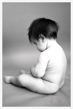
When we print out pho­tographs or pur­chase pieces of art on can­vas, we gen­er­ally get these art pieces framed to ‘fin­ish’ the look. Well how about pho­tographs posted online? Many peo­ple are now post­ing their pho­tographs online with a bor­der to com­ple­ment the piece. But does it really complement?


Some might feel that bor­ders are dis­tract­ing to the visual ele­ments in the photo. A bor­der can fur­ther destroy a photo if it’s too over­whelm­ing to the sub­ject at hand.

Oth­ers can’t do with­out the bor­ders; they serve to help make the photo ‘pop’, make the photo a tad more ele­gant, or depend­ing on the color and con­text of the photo, can also com­ple­ment the ele­ments in the photograph.

Just as every pho­tog­ra­pher has their own tastes in their photo sub­jects, they also have their own opin­ions on bor­ders as a cre­ative ele­ment. Essen­tially, it’s all up to the artist and how they feel their cre­ativ­ity should be displayed.

PHOTO FORUM LINK: http://www.photography.ca/Forums/showthread.php?t=3049

DPI & PPI

A les­son in Pho­tog­ra­phy often over­looks the famous acronyms of DPI and PPI. Two things that often con­fuse the heck out of peo­ple. Why is it that some images show on your com­puter at 72 DPI when you set your cam­era to the high­est res­o­lu­tion? And How does DPI dif­fer from PPI, I mean, can one let­ter in the acronym really make all that dif­fer­ent? YES. Let’s gan­der at the answer to these ques­tions, shall we?


Let’s start with PPI. Pix­els per Inch. This will affect the print size of your photo and will in turn affect the qual­ity of the out­put. If there are too few pix­els per inch, then the pix­els will be very large and you will get a very pix­i­lated image, thus affect­ing the qual­ity of the out­put. There are 2 ways that you can change the print size, by resam­pling or by not resam­pling. Not resam­pling is what you gen­er­ally want to do; this will only change the size of the print out. Using resam­pling will actu­ally change the num­ber of pix­els (and thus the file size) in order to match the print size.

DPI on the other hand refers only to the printer — Dots per Inch. Every pixel out­put is made up of dif­fer­ent col­ors of ink (gen­er­ally 4 or 6 col­ors — depend­ing on your printer). Due to the small amount of col­ors avail­able, the printer needs to be able to mix these inks to make up all the col­ors of the image. So each pixel of the image is cre­ated by a series of tiny dots. A high DPI printer has more dots mak­ing up each pixel, and thus a higher and bet­ter qual­ity image out­put. Vice versa for a lower qual­ity DPI printer.

Peo­ple often use the terms of DPI and PPI as one com­mon one, which is really not the case. They are both dif­fer­ent, and thus should be used as so.

PHOTOGRAPHY FORUM LINK: http://www.photography.ca/Forums/showthread.php?p=11200

Is it still art?

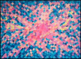
This photo, and oth­ers of sim­i­lar nature are con­sid­ered ‘art’ by some, but far from it by oth­ers. So is it Art? Or can you argue that this, along with an ad for tooth­paste, is just a form of pub­lic­ity and not artistic?

Well,‚ Art has dif­fer­ent mean­ings for dif­fer­ent peo­ple and there is no one answer for this issue. Think about it… have you ever been to a museum and seen a can­vas com­pletely painted in indigo blue? This is top of the line art accord­ing to avid artists. To oth­ers, this is sim­ply a waste of paint and can­vas. Or how about those early black & white nudes, oth­er­wise known as “early porn”. Time man­aged to some­how evolve these pho­tos into art. Or let us reflect on thou­sands of years back, when the cave­men wrote on the cave walls to com­mu­ni­cate and tell a story. Today, these draw­ings are etched in all art his­to­ri­ansž minds as the works of masters.

So truly, art and beauty is in the eye of the beholder and accord­ing to Edward Degas: “Art is not what you see, but what you make oth­ers see”.

Obvi­ously the ‘artist’ of this photo wanted us to see some­thing… A LOT of something.

FORUM LINK: http://www.photography.ca/Forums/showthread.php?t=570

How to Vignette

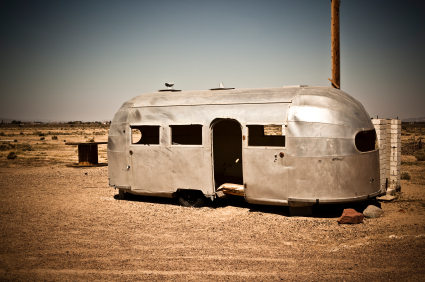
How to make a per­fect Vignette‚¦ add 1 cup oil to ‚½ cup vine­gar, dash with‚¦ now wait a minute. Not Vinai­grette. VIGNETTE. It’s the amaz­ing effect of hav­ing the cen­tral por­tion of the image show­ing while the rest of the image is dark­ened. Pho­tog­ra­phers can apply this effect to their pho­tos to add more empha­sis to their subject.


Pho­to­shop pro­vides numer­ous meth­ods to mas­ter the vignette. Want some insight? You can use an ellip­ti­cal mar­quee tool, inverse the selec­tion, and blur the four cor­ners. You can also brighten or darken the four cor­ners by work­ing with the level bal­ance on the inversed selec­tion. Lens cor­rec­tion (Fil­ter ‚” Dis­tort) also works well for adding a vignette. These are only two meth­ods, but there are cer­tainly more.

But what about those who pre­fer work­ing in a dark­room to achieve their artis­tic photo effects? In the dark­room, this is done by hold­ing an opaque mate­r­ial with a cir­cle or oval cut-out dur­ing the exposure.

Either way, a vignette can add drama or even soften a pho­to­graph all at once. The pos­si­bil­i­ties are endless.

FORUM LINK: http://www.photography.ca/Forums/showthread.php?p=17647

Want a Higher ISO? Expect more Noise.

The bois­ter­ous gen­eral opin­ion on Higher ISOs is just that — noisy.

The higher the ISO when tak­ing pho­tographs with your SLR, the more noise it cre­ates. So all of the efforts we make try­ing to tweak and adjust our cam­eras for that per­fect light­ing, coun­ter­acts with the clar­ity of the photograph.

Thus, here is our plea to the cam­era man­u­fac­tur­ers: We have suf­fi­cient mega pix­els, we cer­tainly don’t need more (Since that is what seems cam­era man­u­fac­tur­ers are giv­ing us nowa­days‚¦). Instead why not give us bet­ter low light/noise performance?

It should be noted that some pho­tog­ra­phers, espe­cially fine art pho­tog­ra­phers, can use noise to their advan­tage in order to cre­ate a cer­tain feel. For the most part though, most pho­tog­ra­phers hate noise.

Pho­tog­ra­phy forum link: http://www.photography.ca/Forums/showthread.php?t=1916