Freeman Patterson exhibition — Montreal till Nov.15/09

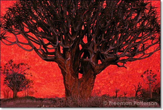
If you live in or near Mon­treal and love artis­tic land­scape pho­tog­ra­phy you OWE it to your­self to take a drive to Dol­lard Des Ormeaux to see the Free­man Pat­ter­son pho­tog­ra­phy exhibition.

Sun­rise at Koker­boomk­loof — ‚© 2006 Free­man Patterson

This exhi­bi­tion is AWESOME. Free­man Pat­ter­son has been shoot­ing land­scapes around the world and teach­ing work­shops for many decades. I’ve been a major fan of his for a good twenty years and I con­sider him to be a mod­ern mas­ter land­scape pho­tog­ra­phy artist. Every­thing about this exhi­bi­tion screams qual­ity. The images them­selves are gor­geous and I spent a good sev­enty min­utes look­ing at each and every one. The com­po­si­tion of each pho­to­graph is very well thought out as you would expect. Free­man is a teacher and expert at visual design and you’ll note the atten­tion he has paid to the fore­ground midground and back­ground. There’s excit­ing stuff going on in all 3 of those zones.‚ But every­thing else in the pho­tographs work too; expo­sure, colour and the print­ing. Gor­geous print­ing on heavy water­colour paper that reveals great tonal­ity from pure white to deep black with excel­lent shadow detail in most prints.

Free­man exhibits about 18 large sized pho­tographs that are around 20 X 30 inches. All the prints are for sale in small lim­ited edi­tions. The Gallery is located in the Dol­lard Civic Cen­ter (across the street from Marche de L’Ouest) 12001, boule­vard De Sal­aberry, Dollard-des-Ormeaux, Qc. H9B 2A7 (Gen­eral Tel. # (514) 684‑1011).‚ Look for the LIBRARY, the gallery is in the base­ment of the library build­ing. Tues.-Wed. 12–4 PM, Thurs.-Fri. 2-5PM, Sat.-Sun. 1–4 PM and there are guided tours avail­able. The gallery is closed on Nov. 11th for remem­ber­ance day.

I have seen NO pub­lic­ity for this show…which is a trav­esty as this work is aching to be seen by pho­tog­ra­phy lovers. So take a drive to the West Island and you won’t be disappointed!

My new logos — Thanks a ton Sylvain Grand’Maison

I’ve been want­ing a new logo for my own per­sonal pho­tog­ra­phy for quite some time now. There’s just some­thing about ‘sign­ing your work’ that I feel is impor­tant. For me, a sig­na­ture pro­vides a sense of clo­sure. There are so many ways to tweak/modify/enhance a pho­to­graph that some­times you’re not sure if your ver­sion is the fin­ished ver­sion. A sig­na­ture allows you to say, OK enough now, I’m done with this image, let’s move on.

I’d like to thank Syl­vain Grand’Maison BIG TIME for the great work that he did for me. For those of you that don’t know Syl­vain, he has one of the most pop­u­lar French Pod­casts (even though he’s per­fectly bilin­gual) in Que­bec called le Que­bec en Bal­adod­if­fu­sion. He also helps busi­nesses and indi­vid­u­als get started in the social media space and works as a con­sul­tant in this regard. So why did I ask him to cre­ate my logos?  That’s because his back­ground is in graphic design and he still takes on the occa­sional graphic design gig.

So now I need YOUR help. I really dig both of these logos and I think I know which one I like best but I’d like some opin­ions. Which one of these above logos do you like bet­ter, the left one or the right one?

In choos­ing these logos Syl­vain pre­sented me with a bunch of dif­fer­ent choices on totally dif­fer­ent themes. Here is another design Syl­vain cre­ated. I love this one as well — it has a seri­ous Russ­ian feel. I’m not sure what I’ll use this red design for, but I do know what my next Face­book avatar will look like.

My new logos — Thanks a ton Sylvain Grand’Maison

I’ve been want­ing a new logo for my own per­sonal pho­tog­ra­phy for quite some time now. There’s just some­thing about ‘sign­ing your work’ that I feel is impor­tant. For me, a sig­na­ture pro­vides a sense of clo­sure. There are so many ways to tweak/modify/enhance a pho­to­graph that some­times you’re not sure if your ver­sion is the fin­ished ver­sion. A sig­na­ture allows you to say, OK enough now, I’m done with this image, let’s move on.

I’d like to thank Syl­vain Grand’Maison BIG TIME for the great work that he did for me. For those of you that don’t know Syl­vain, he has one of the most pop­u­lar French Pod­casts (even though he’s per­fectly bilin­gual) in Que­bec called le Que­bec en Bal­adod­if­fu­sion. He also helps busi­nesses and indi­vid­u­als get started in the social media space and works as a con­sul­tant in this regard. So why did I ask him to cre­ate my logos?‚ That’s because his back­ground is in graphic design and he still takes on the occa­sional graphic design gig.

So now I need YOUR help. I really dig both of these logos and I think I know which one I like best but I’d like some opin­ions. Which one of these above logos do you like bet­ter, the left one or the right one?

In choos­ing these logos Syl­vain pre­sented me with a bunch of dif­fer­ent choices on totally dif­fer­ent themes. Here is another design Syl­vain cre­ated. I love this one as well — it has a seri­ous Russ­ian feel. I’m not sure what I’ll use this red design for, but I do know what my next Face­book avatar will look like.

The city and the people working as one — NOT

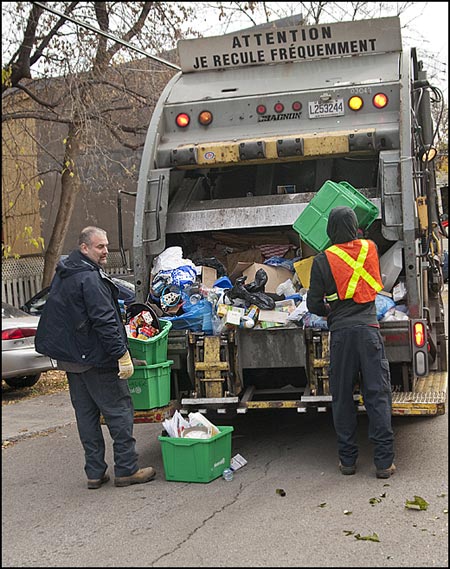
Every pho­tog­ra­pher has sub­ject mat­ter that inter­ests them more than other sub­ject mat­ter. For me, what gets me going the most is fine art pho­tog­ra­phy and por­trai­ture. However.….every once in a while I’ll pull out my cam­era to shoot dif­fer­ent sub­ject mat­ter. Gotta pay those bills. This morn­ing how­ever I pulled out my cam­era because I was sim­ply pissed off at my city. Look at what they are doing with our recy­cling. Does THIS look like a recy­cling truck?

I love Mon­treal. I find the city VERY pro­gres­sive, tol­er­ant, fairly clean and great place to live. My wife and I love it here. We are com­mu­nity minded peo­ple who believe in the envi­ron­ment and we ALWAYS recy­cle as much as we can. We wash out con­tain­ers and bot­tles and sep­a­rate papers to make it easy for the recy­cling crew. We used to see our recy­cling going into a recy­cling truck, where it would get sorted on the spot. As far as I know, crunched up mixed recy­cling in a garbage truck is NOT recycling…it’s frig­gin’ garbage on its way to a landfill.

Does any­one know what is going on here? I mean as much as I love to do my part, I hate wast­ing my time, and I hate munic­i­pal bull­crap. If my recy­cling is going into a land­fill, then why am I wast­ing my frig­gin’ time?

73 — Landscape photography tips — improving boring landscapes

Pho­tog­ra­phy pod­cast #73 is all about land­scape pho­tog­ra­phy and how to improve your land­scape pho­tog­ra­phy. Many new­bies and advanced ama­teurs con­sis­tently won­der if their land­scape pho­tog­ra­phy is any good. This pod­cast offers up a fair pile of tips to help get your land­scape pho­tog­ra­phy to the next level. Some of the things we talk about include; light­ing for land­scapes, the back­ground and the fore­ground, what makes land­scapes inter­est­ing, expo­sure and land­scape pho­tog­ra­phy, fil­ters in land­scape pho­tog­ra­phy, tripods and post production.

Landscape photography
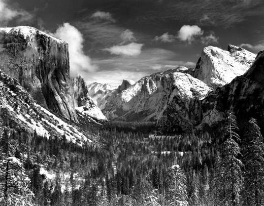
Yosemite Val­ley, Win­ter 1940 by Ansel Adams

Note the points of inter­est in the fore­ground, back­ground and midground, note the full range of tones and note how skill­fully our eyes are being guided. This is no acci­dent, it’s the result of great plan­ning (the light) exe­cu­tion (exposure/filters/composition) and fin­ish­ing touches (dark­room post-processing — done these days using a graph­ics program).

Landscape photography
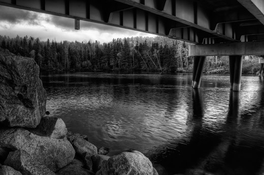
Fish­ing spot by Kat

Kat has a great han­dle on the range of tones, expo­sure and com­po­si­tion here and I really like this shot. It’s miss­ing just a lit­tle some­thing of inter­est IMO to get the big “WOW!” Per­haps if a large rock was dropped in the midground with mov­ing rip­ples that would have done it.… this shot is so close it just needs a hint of some­thing “extra”.

Landscape photography
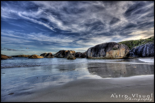
Fly with me…across Aus­tralia (part of a series) by Mad Aussie

This one con­tains the “Wow!” fac­tor for me. Great colour, range of tones, expo­sure and com­po­si­tion. Note the reflec­tions in the fore­ground, the rocks in the midground and that awe­some sky in the back­ground. I love how the midground and back­ground seem to meld into one another.

Links /resources men­tioned in this podcast:

The Ansel Adams gallery
Dar­win Wiggett — Fab­u­lous land­scapes
Rule of thirds pod­cast
His­togram pod­cast
October’s “Scary-Mysterious-Halloween”‚assignment on the Photography.ca forum
Please join the Photography.ca fan page on Face­book
My Face­book pro­file — Feel free to “friend” me

My Twit­ter page — I will fol­low you if you fol­low me (Hey that’s a Gabriel lyric) — Let’s con­nect

If you are still lurk­ing on our forum,
feel free to join our friendly :) Pho­tog­ra­phy forum

Thanks to‚ jack­la­bel, and Kent Wil­son who posted a blog com­ment about our last pod­cast. Thanks as always to every­one that sent com­ments by email about our last pod­cast. Although ALL com­ments are appre­ci­ated, com­ment­ing directly in this blog is pre­ferred. Thanks as well to all the new mem­bers of the bul­letin board.

If you are look­ing at this mate­r­ial on any other site except Photography.ca — Please hop on over to the Photography.ca blog and pod­cast and get this and other pho­tog­ra­phy info directly from the source. I Sub­scribe with iTunes I Sub­scribe via RSS feed I Sub­scribe with Google Reader I Sub­scribe for free to the Pho­tog­ra­phy pod­cast — Photography.ca and get all the posts/podcasts by Email
You can down­load this pho­tog­ra­phy pod­cast directly by click­ing the pre­ced­ing link or lis­ten to it almost imme­di­ately with the embed­ded player below.

3 days left — Mois de la Photo — Montreal

There are only 3 days left to visit Le Mois de la Photo (Trans­la­tion: photo month) in Mon­treal. Le Mois de la Photo is a pho­tog­ra­phy event that takes place in Mon­treal every sec­ond year. I’ve been going to this event reg­u­larly in Mon­treal for about a decade. There is always a HUGE vari­ety of pho­to­graphic styles (from pho­tog­ra­phers from around the world) in this event and most exhi­bi­tions (espe­cially this year) are what I would call ‘alternative’.

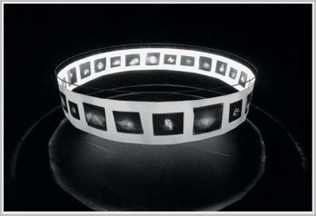
From Hand to Mouth, 1993. Instal­la­tion view, The Amer­i­can Cen­ter, Paris, 1995. Photo: Jeff Guess. Cour­tesy of the artist

The above pho­to­graph (and this is one of the many exhi­bi­tions that I per­son­ally vis­ited) is a great exam­ple of ‘alter­na­tive pho­tog­ra­phy’ and‚ think­ing out­side of the box. The goal of this exhibit is not sim­ple, it requires thought; active thought. Peo­ple will expe­ri­ence this exhibit in a per­sonal way. Some will like it, some will hate it, and oth­ers will scratch their heads and go “Hmmmm”. Per­son­ally, I dug it big-time. I like things that are dif­fer­ent. I like to think and feel. I’m not into McDonald’s and their freak­ishly annoy­ing main­stream clown.

Here’s the ‘offi­cial web­site’ write-up on Guess’s exhibition:

With From Hand to Mouth (1993), a 22-metre long pho­to­graphic series, Jeff Guess treats view­ers to an orig­i­nal visual expe­ri­ence. The piece takes the form of a cir­cu­lar panorama hung from the ceil­ing of a dark­ened room. The artist assigns a par­tic­u­lar place to view­ers, who are invited to step into the cen­tre of the instal­la­tion. With­out a priv­i­leged view­point that would make it pos­si­ble to take in all the images at once, the work invites view­ers to move about, to cir­cu­late. From Hand to Mouth is shown with a sin­gle, iso­lated pho­to­graph, Fonce Alphonse (1993).

This exhi­bi­tion is just one of many that make up this year’s Mois de la photo. So get your shoes on and get out there this week­end to see the work before the exhi­bi­tion is over. Bring an open mind, your brain but leave your cash at home. The exhi­bi­tions and men­tal stim­u­la­tion are free.

Underdog photo exhibition — Montreal

Yes­ter­day I went to see the Under­dog pho­tog­ra­phy exhi­bi­tion in Mon­treal. It’s a gallery specif­i­cally opened to sell beau­ti­ful prints of shel­ter dogs AND have dogs there at the gallery (from shel­ters across Mon­treal) that are avail­able for adop­tion. The pho­tographs are by pho­tog­ra­pher Jaime LeBlanc and they are well done indeed. All the money from the sale of the images goes to shel­ters. This image was taken at the exhi­bi­tion yes­ter­day with my cameraphone.

Today was sup­posed to be the last day until 7pm at 4922 Sher­brooke W. (514) 969 3376
BUT the response has been so amaz­ing that they are con­tin­u­ing the exhi­bi­tion for a short while.

72 — Exposure compensation

Pho­tog­ra­phy pod­cast #72 dis­cusses how to use expo­sure com­pen­sa­tion. It’s a fairly sim­ple con­cept that just means devi­at­ing away from (or com­pen­sat­ing against)‚ the cam­era meter’s rec­om­mended expo­sure to make the image brighter or darker. We also talk about which cam­era modes you’ll want to use expo­sure com­pen­sa­tion with, and I dis­cuss why pro­gram mode sucks and should be avoided. Even though expo­sure com­pen­sa­tion in pho­tog­ra­phy is an easy con­cept, I dis­cuss the rea­son­ing behind it, why I fre­quently use it and why you should too.

exposure compensation
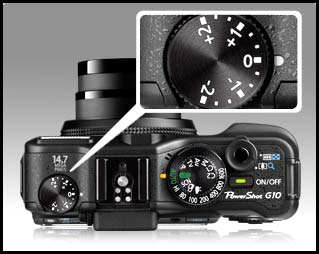
The expo­sure com­pen­sa­tion dial on the Canon G10

Links /resources men­tioned in this podcast:

Orig­i­nal sug­ges­tion thread from our forum — Thanks Iggy!
September’s “New Beginnings”‚assignment on the Photography.ca forum
Please join the Photography.ca fan page on Face­book

My Face­book pro­file — Feel free to “friend” me

My Twit­ter page — I will fol­low you if you fol­low me (Hey that’s a Gabriel lyric) — Let’s con­nect

If you are still lurk­ing on our forum,
feel free to join our friendly :) Pho­tog­ra­phy forum

Thanks to Nijip, jack­la­bel, jab­ber and Tom Restis who posted a blog com­ment about our last pod­cast. Thanks as always to every­one that sent com­ments by email about our last pod­cast. Although ALL com­ments are appre­ci­ated, com­ment­ing directly in this blog is pre­ferred. Thanks as well to all the new mem­bers of the bul­letin board.

If you are look­ing at this mate­r­ial on any other site except Photography.ca — Please hop on over to the Photography.ca blog and pod­cast and get this and other pho­tog­ra­phy info directly from the source. I Sub­scribe with iTunes I Sub­scribe via RSS feed I Sub­scribe with Google Reader I Sub­scribe for free to the Pho­tog­ra­phy pod­cast — Photography.ca and get all the posts/podcasts by Email
You can down­load this pho­tog­ra­phy pod­cast directly by click­ing the pre­ced­ing link or lis­ten to it almost imme­di­ately with the embed­ded player below.

Portrait without a head

Do all por­traits need a head or is it okay to frame or crop a photo so that it is head­less? Most times I’d say, “for the love of God include the head”. Nor­mally we con­nect with the sub­ject of a por­trait pri­mar­ily by look­ing at the subject’s eyes, which reveal much about the per­son being photographed.

But.…once you know the rules, you can try to break them to achieve a par­tic­u­lar result. This image is a good exam­ple of a head­less por­trait that works IMO. If we try to ana­lyze WHY it works, it works because the cou­pled ele­ments tell a story. The Jake tat­too on the hand cou­pled with the suit, cou­pled with the Royal Monaco car actu­ally tell a SPECIFIC story. These are all ele­ments of the movie The Blues Broth­ers and both the pho­tog­ra­pher and I likely show our age by know­ing this fact.

How­ever, even if I did not catch the Blues Broth­ers con­nec­tion, for me this shot still works. The ele­ments are still there. The tat­too, older freck­led skin, suit and older car all sug­gest a story. The fact that the shot is in black and white rein­force this fact. It’s up to the viewer to extract the story for them­selves, but all the ele­ments are there.

Okay then — do you agree? What do YOU think about this shot and the con­cept of a head­less portrait?

Many thanks to 1putts of our pho­tog­ra­phy forum for allow­ing me to use this image. Here’s the orig­i­nal photo.

71 — Portable flash

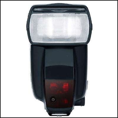
Pho­tog­ra­phy pod­cast #71 dis­cusses the prin­ci­ples of using a portable, exter­nal flash. We talk about how flash works, the dif­fer­ent types of portable flash, on cam­era and off cam­era flash, using a portable flash as a main light source ver­sus a fill light, bounc­ing the flash, sync speeds and more.

Depth of field guide

Depth of field guide

Links /resources men­tioned in this pod­cast:
Pod­cast #33 — Stu­dio light­ing for begin­ners
Pod­cast #47 — Flash sync speeds
Pock­etWiz­ard from B&H
Peanut slaves from B&H

August’s‚ “Water”‚ assign­ment on the Photography.ca forum

If you are still lurk­ing on our forum,
feel free to join our friendly :) Pho­tog­ra­phy forum

Thanks as always to every­one that sent com­ments by email about our last pod­cast. Although ALL com­ments are appre­ci­ated, com­ment­ing directly in this blog is pre­ferred. Thanks as well to all the new mem­bers of the bul­letin board.

If you are look­ing at this mate­r­ial on any other site except Photography.ca — Please hop on over to the Photography.ca blog and pod­cast and get this and other pho­tog­ra­phy info directly from the source. I Sub­scribe with iTunes I Sub­scribe via RSS feed I Sub­scribe with Google Reader I Sub­scribe for free to the Pho­tog­ra­phy pod­cast — Photography.ca and get all the posts/podcasts by Email
You can down­load this pho­tog­ra­phy pod­cast directly by click­ing the pre­ced­ing link or lis­ten to it almost imme­di­ately with the embed­ded player below.

To crop or not to crop this photograph

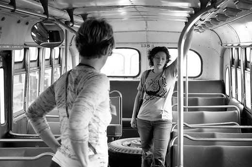
Aside from tak­ing a ‘win­ning shot’ myself, I love to help peo­ple get the most from their images and I try to pro­vide daily advice to those peo­ple that post on our forum. Some­times peo­ple take my advice and some­times they don’t and that’s totally cool. The pho­tog­ra­pher of course decides the ulti­mate fate of his/her photograph.

Here is an exam­ple image that I wanted to share taken by JJelling a mem­ber of our pho­tog­ra­phy forum.

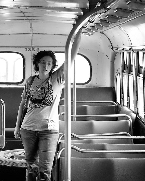
When I first looked at this image, I imme­di­ately liked it. I like the envi­ron­ment and the expo­sure is very well han­dled here. The thing I like about the shot the most though is the expres­sion of the girl on the right. It sug­gests day­dream­ing, veg­ging out or‚pensive thought dur­ing the daily com­mute.‚ What I like least about this shot is the woman on the left. She’s just not doing any­thing that con­tributes to the photo, she is shot from behind and takes up a promi­nent posi­tion in the pho­to­graph. I wish she was not there.

My sug­ges­tion to JJelling was to sim­ply crop her out and MAKE the shot about the girl on the right. Here’s my crop of his pho­to­graph which he gra­ciously allowed me to do.

For me, this image tells a stronger and tighter story, it’s clearer. But what about those beau­ti­ful win­dows on the left that get cropped out along with the girl?‚ Although I liked those win­dows and the light­ing, for me they needed to be sac­ri­ficed to get the strongest image pos­si­ble, albeit a dif­fer­ent image. Crop­ping out extra­ne­ous parts of images is a great way to guide the eye of the viewer and make the image stronger. Some­times the result­ing crop is obvi­ously bet­ter. Other times (like in this shot per­haps) we may be less sure.

What do other peo­ple think?‚ Which shot do YOU pre­fer? here’s the orig­i­nal link to the thread.

Thanks Mad Aussie

A short while ago a mem­ber of our pho­tog­ra­phy forum, Mad Aussie, toured west­ern Aus­tralia. Dur­ing one of his shoot­ing days, he etched out our web­site address on a beach. I thought that was really cool and just wanted to say thanks!