Every month on our photography forum members nominate images that they like. Then at the end of the month I choose an excellent image and talk about why it rocks. The photo I choose is not necessarily the best one of the month. I’ve come to realize it’s not really logical to pit images from totally different genres against each other. That’s why there are categories in photo contests. I just choose a photo that has extremely strong elements that we can learn from.
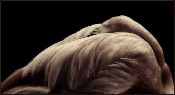
This month’s choice is Pink by Barefoot
I chose this image for several reasons:
1 — Composition — The is a very interesting and unusual composition of a gorgeous bird sleeping. I really like the curve all around the bird’s body and where the eye falls in the image. The framing is also interesting here and Barefoot has clearly ‘made this his own’. The pure black background also creates interesting negative space here.
2 — Lighting — The lovely lighting here is soft overall and reveals lovely detail in most of the bird’s plumage. That said, certain areas of the photograph are quite dark but not too dark for my eye. I really like the dramatic aspect of the light in those selective zones.
3 — Post processing — The post processing here is lovely. Making the background go to pure black doesn’t always work but it works very well here to compliment the form of the bird. I dare say that some of the darker areas in the bird’s plumage actually match the background and this works for me. The bird is rendered in desaturated tones that I find very striking and suitable to the subject and mood of the image.
For all these reasons, this is my choice for image of the month. Since we all have opinions, some members may disagree with my choice. That’s cool but THIS thread is not the place for debate over my pick, NOR is it the place to further critique the image. The purpose here is to suggest strong elements in the photo that we may learn from.
Congrats again Barefoot!


Great image, good tonal quality, I had to look to see what it was.…. interesting.