Photography podcast #107 features an Interview with Canadian Nature photographer Royce Howland. In this podcast we talk specifically about how to get realistic colours using the HDR process. HDR (high dynamic range) is a process that allows us to capture details in the highlighs and the shadows of our images by shooting multiple frames of the same image at different exposures and then blending them in software.
Many HDR images that we see on the web have really wonky and unrealistic colours. We pass no judgement on these types of images but this podcast is dedicated to getting realistic colours using the HDR process. We summarize the process from why we do this, to capture, to gear, to using the software to create the images. We also discuss the differences between the HDR process and using graduated neutral density filters.

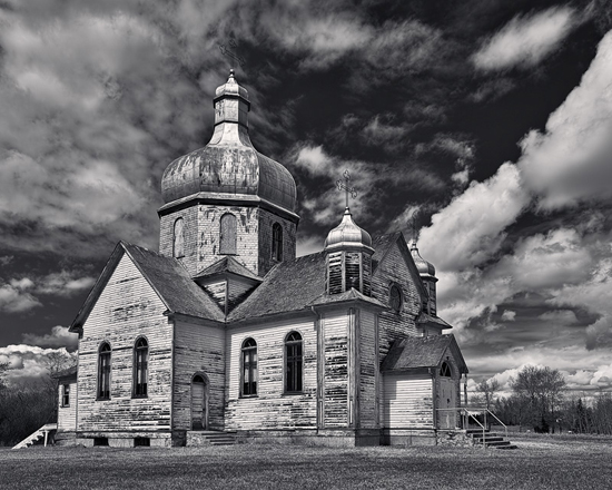
Old Prairie Church & Storm Front, Mundare Alberta Canada © Royce Howland

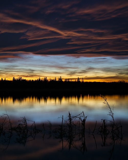
That Halloween Mood, Glenmore Reservoir Calgary Alberta Canada © Royce Howland
Links /resources mentioned in this podcast:
Royce Howland website
Royce Howland’s feature on Photography.ca
Older HDR article by Royce Howland
HDRSoft — Makers of Photomatix
Oloneo — Makers of PhotoEngine
Red Giant — Makers of Magic Bullet PhotoLooks
HDR Labs — HDR information resource
Topaz Adjust
HDR Efex Pro
If you liked this podcast and want to review it on Itunes, this link gets you to the main page
If you are interested in writing for our blog please contact me photography.ca ( A T ) G m ail Dot co m (using standard email formatting)
Please join the Photography.ca fan page on Facebook
My Facebook profile — Feel free to “friend” me — please just mention Photography.ca
My Twitter page — I will follow you if you follow me — Let’s connect — PLEASE email me and tell me who you are in case I don’t reciprocate because I think you are a spammer.
If you are still lurking on our forum,
feel free to join our friendly ![]() Photography forum
Photography forum
Thanks to Benny and Delbensonphotography who posted blog comments about our last podcast. Thanks as always to everyone that sent comments by email about our last podcast. Although ALL comments are appreciated, commenting directly in this blog is preferred. Thanks as well to all the new members of the bulletin board. Most of the links to actual the products are affiliate links that help support this site. Thanks in advance if you purchase through those links.
If you are looking at this material on any other site except Photography.ca — Please hop on over to the Photography.ca blog and podcast and get this and other photography info directly from the source. |Subscribe with iTunes|Subscribe via RSS feed |Subscribe with Google Reader|Subscribe for free to the Photography podcast — Photography.ca and get all the posts/podcasts by Email
You can download this photography podcast directly by clicking the preceding link or listen to it almost immediately with the embedded player below.
Thanks for listening and keep on shooting!
Podcast: Play in new window | Download


Downloaded and going to listen to it on my flight to Iceland at the weekend. Sure to be great, Royce is a super character and a good friend.
These are beautiful images, The toning on Old Prairie Church is breathtaking! HDR just keeps getting better and better, awesome work mate!
Peter,
Studio Coordinator
Toronto Photo Studio
Great image. What an awesome job! Awesome podcast! I enjoyed this article and reading the comments. Nice discussion.
Excellent podcast. Like Lucille B., i had been put off this process by over-the-top work that didn’t quite gel with my interpretations, but this podcast has given me the urge to try more HDR and keep it natural.
Thanks for the comments, folks! Much appreciated by Marko and myself.
Part of maintaining a photorealistic look is the software used, but as I noted in the podcast I use a variety of software tools in my work and generally go for a photorealistic look with all of them. It’s just a question of how to drive the specific settings & controls in a particular tool, based on knowing what objectives you want for your images.
We didn’t have the time (nor is it really the right format) to go into technical details of using any given software package during the podcast. I do cover a specific workflow for Oloneo PhotoEngine in my article for the Fall 2011 issue of Outdoor Photography Canada, “6 Tips for Photorealistic HDR”. Back issues may still be available, if you’re interested in reading that article. I haven’t published anything equivalent to it online yet.
Causes for unrealistic looking HDR results usually fall in two broad areas. First, not having a clean master image at the start — too much noise, frames that don’t align because the camera was moving too much, subjects moving around creating ghost images, digital artifacts that creep into the process and get magnified by the HDR software, etc. In my view these things all are primarily technical flaws in the capture process, leading up through the HDR merging, resulting in a 32-bit master file that doesn’t have the high fidelity we’d want from it.
The second group of things that contribute to unrealistic looking HDR results comes from choices over how 32-bit high fidelity master image will be toned. These are not technical flaws, rather they are creative choices. People can deliberately go more realistic, or more surrealistic, whatever they wish it’s under their control.
To stick more with a realistic look, here are a few quick HDR toning tips, all of which typically follow the golden rule of “everything in moderation”.
1. Use moderate toning strength. Photomatix calls it “Strength” or a combination of “Tonal Range Compression” & “Contrast Adaptation”, depending on which toning function you use. PhotoEngine calls this “TM Strength”. In PhotoEngine, I often use values between 30 – 60, about as high as I can go before the image starts to look over-done. Watching the histogram as I adjust TM Strength, I can see roughly where to stop. Usually it’s the point where the histogram stops expanding and begins contracting again.
2. Apply moderate detail. HDR can really kick up microcontrast, which is often used for that gritty “grunge” look. If you don’t want grunge but do want good microcontrast, pay attention to the “Microcontrast” and “Micro-smoothing” settings in Photomatix, or the “Detail Strength” in PhotoEngine. For the latter, I typically go to 20 +/- 10. It’s very easy to overdo this setting, so keep it conservative. I typically dial it up to where I can see the effect clearly, then back off from that point.
3. Balance local vs. global contrast. HDR software is often forced to make compromises in the contrast of the image as it tries to fit a large & fine-grained contrast range in the high fidelity master image, down into what a normal 8-bit or 16-bit file can represent. Sometimes a loss of global contrast results, making the image look flat & over-all washed out; or a loss of local contrast can sap away the “snap” and feeling of dimension that you want.
In Photomatix, the previously mentioned “Strength”, “Microcontrast”, “Tonal Range Compression” and “Contrast Adaptation” settings apply here, as do “Luminosity” and “Gamma”. The 2 main HDR toning functions in Photomatix are often at odds with each other — the “Details Enhancer” function emphasizes local contrast at the expense of global contrast, and the “Tone Compressor” function does the reverse. I often run both functions against the same HDR source file, to produce a pair of toned versions which I then layer & blend together in Photoshop to get the best of both.
With PhotoEngine, I find it’s easier, with somewhat different looking results too. (Analogous to the way different film stocks don’t look exactly like each other.) The “TM Strength” and “Detail Strength” settings both directly influence contrast, global & local respectively for the most part. Plus there’s old school “Contrast” and “Brightness/Brightness” curve settings that work like the contrast & curves tools in Photoshop for further tweaking image contrast in a single toning run.
4. Control the saturation. All the above settings work on image exposure, tone & contrast, and should be done first. After that, assess what has happened to color hue & especially saturation. Don’t do it the other way around, because dialing in hue & saturation first and then adjusting contrast will upset the balance in color. In Photomatix, there’s a global “Color Saturation” (or “Saturation”) setting which I rarely adjust upwards, certainly not by much; more often I tweak it slightly downwards from the defaults. In PhotoEngine, color controls are more flexible. There’s the global “Saturation” setting which again I never adjust, and then a series of color curves called “Saturation/Saturation”, “Hue/Saturation”, “Hue/Luminance”, and “Hue/Hue”. I like these controls and use them to dial in adjustments to color with control over the brightness or hue ranges affected.
HDR toning can boost certain hues, for example the blues in an evening winter scene, or the reds in a scene with strong direct sunlight. With color adjustments, I make sure to keep to a more realistic color palette.
5. Do a reference check. When processing, it’s really easy to step onto a slippery slope and gradually keep pushing adjustments past the point where they will look realistic any more, but without realizing things have gone too far. So I often take the best single original exposure and do a quick normal processing of it in my RAW converter of choice. This sets a baseline for contrast and color, and I check the progress of my work against the baseline from time to time. I will deviate from the baseline because I’m creatively interpreting the light, not being a slave to the limitations of a single camera exposure. But if I do deviate, I want to understand and consciously be okay with the effect it creates, relative to what a more “normal” exposure of the scene might look like. If I’ve gone off the path somehow, I can choose to bring things back in the HDR toning controls, before doing all my other finishing work in Photoshop.
Enjoy your HDR’ing…
Great timing! My colleague and I were trying to produce HDR yesterday at lunch. I popped on the podcast on the way home and to my surprise, all about HDR. We have yet to have great success, but will try the software Royce suggested. Also the technique as a replacement to ND filters was a good piece of knowledge, have to try that.
I listened to podcast 107 today, and would like to say that this is the most informative interview I have ever heard on HDR.
Your questions and your guests responses were superb.
I have been taking photos for nearly 50 years of which the last 10 in digital format.
I have never heard the bit depth so well explained and the reason for using HDR software due to the tone variations. Well done and please keep getting guests like this, it was a superb podcast.
Fantastic podcast!! I have been put off by the weird HDR images I have seen but now i see i can get more neutral looking colors with great range in the tones. Thanks Royce and Marco
Great podcast. I’ve long wondered about HDR and had primarily seen the over-saturated approach of HDR imagery, which can produce some interesting imagery, but the application described– especially as a replacement for ND filters– was a real eye opener.