Every month on our photography forum members nominate images that they like. Then at the end of the month I choose an excellent image and talk about why it rocks. The photo I choose is not necessarily the best one of the month. I’ve come to realize it’s not really logical to pit images from totally different genres against each other. That’s why there are categories in photo contests. I just choose a photo that has extremely strong elements that we can learn from.
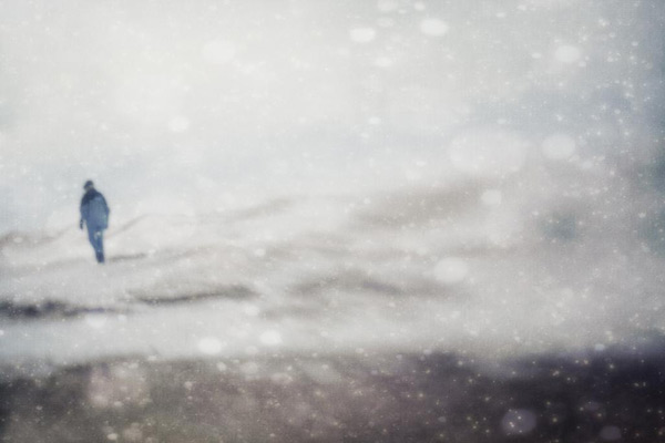
This month’s choice is (Click to see the larger version of this image) And miles to go before I sleep… And miles to go before I sleep by jumpinjimmyjava
I chose this image for several reasons:
1 — It tells or suggests a strong story & Composition — The title of the image is a well known phrase from a poem that many of us studied in High School (Stopping by Woods on a Snowy Evening by Robert frost). Just reading the title helps to support this image and veers our interpretation of it in a certain direction both with visual and thematic elements. I love the position of the man in this image. It’s close to the edge but not quite at the edge. This adds tension to the image and helps support the theme that “there’s still work to be done”, it’s not over just yet) .The wintry scene also supports the theme of a person in their sunset years but the image is bright, not dark, again supporting a thematic element.
I like the layered aspect of the image where the bottom of the image is darker than the rest. The middle part of the image shows lines moving from right to left. The top part of the image shows more sky and is distinct from the other 2 parts of the image. These ‘divisions’ or layers as I like to call them add visual interest to the image. Our eyes like them.
2 — Colour — The subtle colour palette in this image works very well for me, the colours are very harmonious. For me they are calm, well chosen colours. The blue of the jacket stands out really well against the white and brings our full attention to the focal point of the image. In addition, the blue of the jacket is complimented by other subtle blue tones in the image, again helping to create the overall visual harmony.
3 — Post processing — This image is a composite of several images or textures. I don’t know exactly how many but I’d say at least 3 (the snow flakes, the man, the wintry landscape). Either way the blending of the images is well done to my eye and each part of the image compliments the other parts.
And the whole image, is greater than the sum of its parts.
For all these reasons, this is my choice for image of the month. Since we all have opinions, some members may disagree with my choice. That’s cool but THIS thread is not the place for debate over my pick, NOR is it the place to further critique the image. The purpose here is to suggest strong elements in the photo that we may learn from.
Congrats again jumpinjimmyjava for creating this wonderful themed image!


What a surprise Marco to see you chose my photo for image of the month. What a thrill. Sorry I happened upon it all these months later. I must start reading your blog more often ! I so much enjoy listening to all your podcasts but your blog really reinforces your tips and techniques. Looking forward to your next post — jimpinjimmyjava
Wonderful image, I really like how it sparkles and looks cold at the same time.
I really like the mood in this image