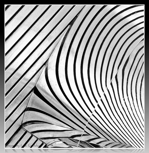
Every month on our photography forum members nominate images that they like. Then at the end of the month I choose an excellent image and talk about why it rocks. The photo I choose is not necessarily the best one of the month. I’ve come to realize it’s not really logical to pit images from totally different genres against each other. That’s why there are categories in photo contests. I just choose a photo that has extremely strong elements that we can learn from.

Repetition in Monochrome by Casil403
This month’s choice is Repetition in Monochrome by casil403.
I chose this image for several reasons:
Spotting the scene — Abstracts like this are often all around us, and the vast majority of us will never ever see them. Looking is not the same as seeing. Seeing takes longer, it takes more time and more patience. Hats off to Casil for seeing this fabulous abstract.
Composition — Even though we are not sure what we are looking at, this abstract scene is very well composed and very deliberate. Both the curved lines and the straight lines in this image intrigue and successfully guide our eye through the image. The repetitive quality of the curves and lines is also very pleasing. In case people are wondering what the abstract actually is, Casil wrote …“it’s the reflection of a soffit ceiling on a mirrored pole.”
Post processing — Black and white was an excellent choice for this scene. The lack of colour emphasizes the graphic quality of the lines and patterns that we see. The tonal quality of the scene (good representation of tones) as well as the frame around the scene suits this image extremely well.
For all these reasons, this is my choice for image of the month. Since we all have opinions, some members may disagree with my choice. That’s cool but THIS thread is not the place for debate over my pick, NOR is it the place to further critique the image. The purpose here is to suggest strong elements in the photo that we may learn from.
Congrats again Casil for seeing, capturing and processing this wonderful find!


