Every month on our photography forum members nominate images that they like. Then at the end of the month I choose an excellent image and talk about why it rocks. The photo I choose is not necessarily the best one of the month. I’ve come to realize it’s not really logical to pit images from totally different genres against each other. That’s why there are categories in photo contests. I just choose a photo that has extremely strong elements that we can learn from.

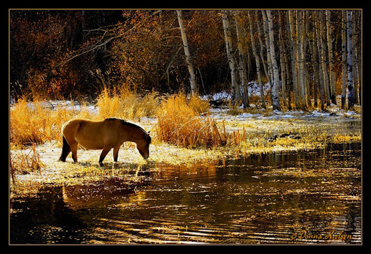
Golden Glitter by Donna
This month’s choice is Golden Glitter by Donna
I chose this image for several reasons:
Composition — I just love the composition here, it’s so pleasing to the eye. The rule of thirds is working well for me here with approximately 1/3 foreground, 1/3 midground and 1/3 background when you look horizontally. When you look vertically it’s a classic 1/3rd left and 2/3rds to the right. Some people scoff at the rule of thirds.…scoff away…if the horse were centered here, the image would not be as visually interesting. The horse was likely deliberately captured in an excellent spot which is the brightest spot in the image. Our eye goes right to the horse. The water line in the midground is another interesting element.
Colour palette/tonal quality — These are WOW colours for me even though they are quite contrasty in parts of the image. The colour palette is golden warm, well balanced, and the tones are harmonious.
Lighting/exposure — This is tricky lighting which means tricky exposure and it is very well handled. The backlighting/sidelighting on the horse has just enough detail on its side to make it interesting and provide a bit of reflection in the water. The head is partially silhouetted which adds drama and grabs our eye as previously mentioned.
For all these reasons, this is my choice for image of the month. Since we all have opinions, some members may disagree with my choice. That’s cool but THIS thread is not the place for debate over my pick, NOR is it the place to further critique the image. The purpose here is to suggest strong elements in the photo that we may learn from.
Congrats again Donna for capturing this gorgeous scene!


Congrats, Donna! Wonderful image!
Thanks for the regular comments Jackie!