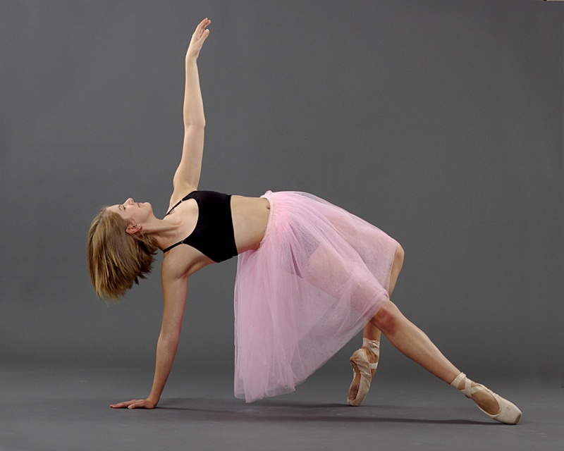
A few more from last week.
Attachment 18318
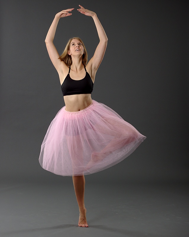
Attachment 18319
Attachment 18320
Printable View
A few more from last week.
Attachment 18318
Attachment 18319
Attachment 18320
All three are great!!! I like #1 the best. #2 seems like the POF is on her bottom foot/ankle, it is a little soft in her face (not too bad).
I like the smile in the 3rd one and the action in the second.
She has good form. It's great lighting to work with. Nicely exposed. I can't see any issue with hue on my monitor.
I went back and looked again, I don't see it now, but I swear I saw a tiny bit of green hue to her skin tone in #3. Nothing major. It could have just been my eyes. You know when you view something for a while and than look at some thing else and you see the opposite color. Maybe I was just viewing a lot of red some where.Quote:
Originally Posted by Mad Aussie
I think my preference is the first one.
Thank you, Everyone.
Must have been something on your end, A.T. I set a custom white balance based on the neutral grey of the background at image capture time and did not adjust the white balance on the computer. They are all identical for white balance both in this set and the Dana set (and the third one I haven't finished editing yet) :)