 LinkBack URL
 About LinkBacks

i feel naked without my filters

This is a discussion on b/w within the Digital photography forums, part of the Photography & Fine art photography category; i feel naked without my filters...
 Member
i feel naked without my filters
Last edited by automaton2; 07-17-2006 at 03:41 PM.
Administrator
It's nice to see these black and whites automaton2. Although I like the funky coloured shots as an occasional effect, after seeing quite a few of them, you kind of wonder "what else can this photographer do". Also those coloured shots, although interesting were not very flattering to the model. If the intent was artsy portraits for your portfolio it works. But USUALLY if it's a portrait for the model, it should flatter the model which those shots did not really do.
In terms of these shots - Here goes:
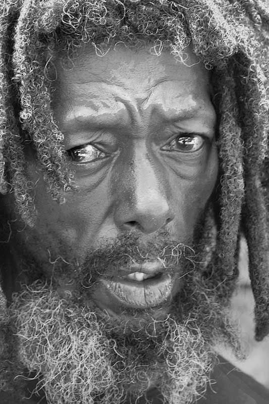
The top and bottom shots are very good portraits - especially the top shot.
The middle shot is my least favorite. There's really nothing going on there.
The last shot is also a fun good portrait but it's not well exposed or not printed well (It's hard to tell as I can't see the neg/file) The tonal range of this shot should be extended for a better shot. It has too little contrast.
Hope that wasn't too harsh!
Marko
Member
thank you
some people think that a nasty tempered analysiswithout helpfull remedy and sarcastic tone
are what critiquing is
your gentlemanly manner and fixative advice and feedback
are well appreciated
frankly rare
will use b/w advice
on next attempts
Administrator
Junior Member
Another very good critique by the Admin. Photo 1 is the best of this series in my opinion. It is a very powerfull shot. It really makes you wonder about the person's hard life. Photo 3 is a very cute shot and yes it needs much more contrast. On my computer it's pretty gray.
Faber
Senior Member
Well, number 2 and 3 for some reason do not show on my computer at all.
In number one, you did a superbe job catching the mood, feelings, perhaps anguish of the model. It has great impact due to your choice of extreme close up as well, emphasizing the eyes and face.
It seems that there is some postprocessing and stylization here but it is somewhat difficult to figure out for sure how much and that is a good thing as well.
Great shot!
Tegan
 Posting Permissions


 Reply With Quote
Bookmarks