 LinkBack URL
 About LinkBacks

f8.0
1/1000s
ISO: 200

This is a discussion on Statue of Edward Cornwallis within the Critiques forums, part of the Photography & Fine art photography category; f8.0 1/1000s ISO: 200...
 Moderator
f8.0
1/1000s
ISO: 200
Senior Member
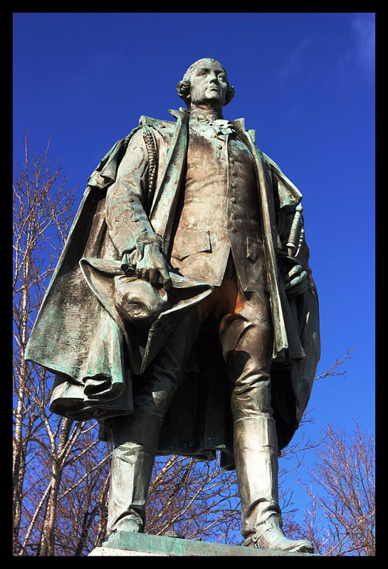
nice one Iggy. How did you get him without a pigeon sitting on him?
Love the colours here.
Feel free to make comments on any of my shots
my blog: http://bambesblog.blogspot.com/
My flickr photostream: http://www.flickr.com/photos/bambe1964/
A painter takes their vision and makes it a reality. A photographer takes reality and makes it their vision.
Senior Member
You're missing an 'h' there Bambi!Originally Posted by Bambi

Moderator
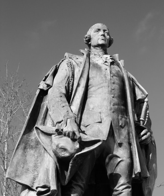
As a shot of a statue goes I find this is quite nice but also quite average if you know what I mean. Composition pretty much is a statue squarely centred. The camera angle does give the impression that he's large and towering above though so that's nice.
I wonder if including the base with his name on it might have been a stronger choice.
Failing that I think zooming or cropping in to around his knees would have had the effect of losing the blown out legs and making more of a feature out of his face seeing as this is about the man in this case. I'm using the thinking ... "What do I want this photo to say?" ... when I say this.
Exposure wise it looks really good considering the bright light you took this in. I wonder if a touch of fill flash might have helped a bit to soften the shadows?
Also, looking at the tones here and the slightly blown out bits on his legs (totally understandable and probably unavoidable in a single exposure) I wonder if this wouldn't convert really nicely to a B&W shot which might help to put him in context with the timeline he's from.
Moderator
Thanks! I really don't know where the pigeons were.
Hahahahaha...
Thanks for the complete review. I can answer a couple of questions you have but then I have to digest what you wrote.
I know what you mean about just an average shot. Honestly, I'm not sure I've found my muse but I think I've discovered that she doesn't like winter
I had one with the name plate below but it just didn't seem to have the impact that this one had. Tried the crop just above the knees and it's kinda cool. Good call. Looks pretty good as a B&W and even sepia. I'll go do some editing and post a few other versions for comment.
Moderator
Black and White version...
Senior Member
you know I like the B&W version! I think with some curves adjustment it would pop out even more!
Feel free to make comments on any of my shots
my blog: http://bambesblog.blogspot.com/
My flickr photostream: http://www.flickr.com/photos/bambe1964/
A painter takes their vision and makes it a reality. A photographer takes reality and makes it their vision.
Moderator
Definitely ... the tones are too weak ... more contrast, more contrast!!
 Posting Permissions


 Reply With Quote


Bookmarks