Results 1 to 6 of 6

Tiffany Vase

This is a discussion on Tiffany Vase within the Critiques forums, part of the Photography & Fine art photography category; I got this idea from Michaelaw's photo of "Dried Flowers..." This is a signed Tiffany vase I found at a ...

  1. #1
    theantiquetiger's Avatar
    theantiquetiger is offline Moderator
    Join Date
    Aug 2011
    Location
    Baton Rouge
    Posts
    2,774
    My Photos
    Please feel free to edit my photos
    Critiques
    Critique my photos anywhere in the forum

    Default Tiffany Vase

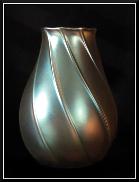
    I got this idea from Michaelaw's photo of "Dried Flowers..."

    This is a signed Tiffany vase I found at a flea market about 10 years ago. It is not too valuable (about $300). It is only about 4 1/2" high and is a gold iridescent color. It was one of the first treasures I found in my treasure hunting hobby.

    The only thing I've done to this image is crop and burn the black cloth under the vase due to some reflection in the fabric.


    This was a second shot I did of it. All I did differently was block the reflection of background light off of it. I first thought it was out of focus (I swore I did 10x live view focus on it), than I noticed the black cloth under it is it perfect focus.


    This is my third image, not as closely cropped

    Last edited by theantiquetiger; 01-02-2012 at 08:47 AM.

  2. #2
    Iguanasan's Avatar
    Iguanasan is offline Moderator
    Join Date
    Jan 2009
    Location
    Halifax, NS
    Posts
    10,917
    My Photos
    Please feel free to edit my photos
    Critiques
    Critique my photos anywhere in the forum

    Default

    Nice play and practice. I really prefer the third shot though I wish you had used a more plain cloth as I find the stripes a bit distracting. You should try it with a white sheet. I bet it would look very cool in front of a white background.
    “If you are out there shooting, things will happen for you. If you’re not out there, you’ll only hear about it.” – Jay Maisel
    ~~~~~~~~~~~~~~~~~~~~~~~~~~~~~~~~~~~~~~~
    Feel free to edit my shots ONLY for use on this forum and critique my shots in ANY discussion area.
    Flickr | Blog | Google+

  3. #3
    Mad Aussie's Avatar
    Mad Aussie is offline Moderator
    Join Date
    Dec 2008
    Location
    Brisbane, Qld, Australia
    Posts
    14,098
    My Photos
    Please ask before editing my photos

    Default

    Quote Originally Posted by Iguanasan View Post
    Nice play and practice.
    Ditto

  4. #4
    vyeko's Avatar
    vyeko is offline Senior Member
    Join Date
    Dec 2011
    Location
    maribor,slovenia,EU
    Posts
    724
    My Photos
    Please do NOT edit my photos
    Critiques
    Critique my photos anywhere in the forum

    Default

    I agree with above and like to say that is best light on second image.First and third have too strong shine.Composition on third is the best.
    Set background more far away from subject than you will not have a problem.

  5. #5
    JAS_Photo's Avatar
    JAS_Photo is offline Senior Member
    Join Date
    Sep 2008
    Location
    Calgary
    Posts
    7,359
    My Photos
    Please ask before editing my photos
    Critiques
    Critique my photos anywhere in the forum

    Default

    The second has the more controlled highlights, but the third allows more breathing room. Nice effort!

  6. #6
    susan is offline Senior Member
    Join Date
    Dec 2011
    Location
    Midwest, USA
    Posts
    486
    My Photos
    Please ask before editing my photos
    Critiques
    Critique my photos anywhere in the forum

    Default

    Quote Originally Posted by vyeko View Post
    I agree with above and like to say that is best light on second image.First and third have too strong shine.Composition on third is the best.
    Set background more far away from subject than you will not have a problem.
    total agreement here. The stripes are subjective tho, (Iggy pointed out) - to me they are subtle and go along with the curves of the vase --- nice bit of knick knack you have there!
    I really like image 2's light, but trade it for the framing of the third so you do see a bit of the cloth. As Vyeko said - be careful of "hot spots"...

    Good job, Tiger!

Bookmarks

Posting Permissions

  • You may not post new threads
  • You may not post replies
  • You may not post attachments
  • You may not edit your posts
  •  

1 2 3 4 5 6 7 8 9 10 11 12 13 14 15 16 17 18 19 20 21 22 23 24 25 26 27 28 29 30 31 32 33 34 35 36