aaaaaa
Printable View
aaaaaa
Sorry, but this one doesn't work well for me I'm afraid.
The scene, overall is overexposed, the model and her eyes aren't sharp, her pose looks very much unnatural and forced, and the zoom effect you've applied is not done well at all. It's obvious where the zoom starts and ends.
If you're interested, put up an unprocessed version, and I'll do what I think you were going for here, and explain my technique for you.
I agree w/MA here on all points except the forced pose; I don't mind the pose
aaaaaa
Hi mellowinman,
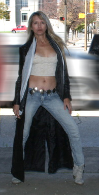
This is where I got to with your image, by the time you chop the girl out of the original image your not left with many pixels to play with.
Attachment 13728
let me know if you want me to write up an explanation of this edit, I'd be interested to see what MA can come up with.
This is just one of those photos where I tried to make something from nothing. Krystal liked her pose in the original, but the overall photo kind of sucks. I took Arthur and Jamie out, and stretched the car, which made me feel the urge to do that motion blur on the edges. It was just my way of trying to get a look out of it. I softened her a bit with some diffusion, and tried to give it sort of a "dreamy" feel.
This is definitely one where I don't care how much anyone goes to town on it. Just don't give her the head of a chicken, or anything. I hate that.
Ok ... here's my efforts.
Going by the title, the idea is to simulate the car racing by rather than parked as it is.
The first shot blurs everything that's not the girl and pavement, the second one goes for a more realistic scene where the background is not blurred, only the car.
Attachment 13729 Attachment 13730
What I did is duplicate the layer (photo) in Photoshop and then apply a motion blur to the top layer.
Then I applied a layer mask to the top layer.
Next, using the paint brush, I painted black on the mask (selecting different brush sizes and opacities as needed) which allows the bottom layer to show through. Any mistake is fixed by switching to a white brush.
The second one is cool.Quote:
Originally Posted by Mad Aussie
I only titled the thread as I did because the shot gave me that impression a bit. There was no intent behind the editing; just did what I did with little or no thought. I often do that.
What you have done is inspired me to "brush up" on my photoshop masking technique.
Thanks!
Cool :)
@Richard - I think your rendition is awesome!!! MA's rendition is more of what the OP was going for, but yours is a piece of art!!! Very nice work with little to work with after the crop!!!
Thanks +theantiquetiger. :)
+mellowinman photoshop is your friend, get to know it well. :)
Quick learner!!!
I just cannot get over the pose, just something off about it. I just feel the shot does her no favours and puts her in a bad light, I know it is very subjective but I tried to see the positive side of it but I think it is a very unflattering photo. I have looked at all the different edits and the are all about the same and she does not come out looking good in any of them. Looks forced the pose I mean and the whole look of her just seems like she was not thrilled about getting her photo taken and put no effort in makeup or her clothes, almost looks like a bad cardboard cutout. I think the idea is great but the end product is just lacking. I know she likes the pose from what I read but I would say we really need to do a reshoot. I hope I don't come off too harsh but I just cannot see this in a good light. I shoot a lot of women these days and I do not care if they like a photo, if I don't it goes into the trash. People think they may look good in a photo but if you are the photographer it is up to you to say well you may like it but I don't and that is all there is to it. I feel I am the judge and jury of any photo I take and it has to be to my liking and that is all there is to it for me.
I'm kind of with AL on this one...her forced pose and poor lighting makes her look old and is unflattering on her neck.....it's the first place my eye goes...to the lines on her neck....sorry. :)
I have to agree with AL and Casil, however your 2nd edit Mellowinman is much better than the original.