Results 1 to 10 of 11

Block & Cleaver

This is a discussion on Block & Cleaver within the Critiques forums, part of the Photography & Fine art photography category; This is from a series of shots I did in downtown Kingston. It was a challenge to get the crop ...

Hybrid View

Previous Post Previous Post   Next Post Next Post
  1. #1
    Greg_R is offline Senior Member
    Join Date
    Mar 2011
    Location
    Burlington, ON
    Posts
    147
    My Photos
    Please ask before editing my photos
    Critiques
    Critique my photos anywhere in the forum

    Default Block & Cleaver

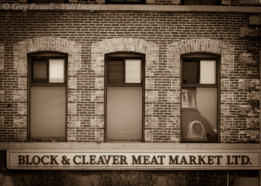
    This is from a series of shots I did in downtown Kingston. It was a challenge to get the crop where I wanted it, and had to play with the vertical lens correction a bit.
    Please feel free to check out my website: http://vidi-images.com/

  2. #2
    theantiquetiger's Avatar
    theantiquetiger is offline Moderator
    Join Date
    Aug 2011
    Location
    Baton Rouge
    Posts
    2,774
    My Photos
    Please feel free to edit my photos
    Critiques
    Critique my photos anywhere in the forum

    Default

    Beautiful shot!!! As for a critique, I will give it a shot. FYI, I am a novice photographer and my technical skills suck, so take my critique with a grain of salt.

    The image is not level horizontally and the reflection in the right window is alittle distracting from the great lettering across the bottom. Other than that, its a great shot. I love the sepia (monochrome) you shot this in.

  3. #3
    Greg_R is offline Senior Member
    Join Date
    Mar 2011
    Location
    Burlington, ON
    Posts
    147
    My Photos
    Please ask before editing my photos
    Critiques
    Critique my photos anywhere in the forum

    Default

    Quote Originally Posted by theantiquetiger View Post
    Beautiful shot!!! As for a critique, I will give it a shot. FYI, I am a novice photographer and my technical skills suck, so take my critique with a grain of salt.

    The image is not level horizontally and the reflection in the right window is alittle distracting from the great lettering across the bottom. Other than that, its a great shot. I love the sepia (monochrome) you shot this in.
    Thanks for your feedback. I levelled it across the bottom, but it remained slightly skewed at the top. I had to look up to get this shot and flattened it using Lightroom. This may be just my lack of LR skills at this point. If someone has an idea how to fix this I'd love to learn.
    Please feel free to check out my website: http://vidi-images.com/

  4. #4
    Bambi's Avatar
    Bambi is offline Senior Member
    Join Date
    Apr 2009
    Location
    Nova Scotia
    Posts
    9,755
    My Photos
    Please ask before editing my photos

    Default

    I'd go with the idea that the building is not level

    I like the sepia toning and the repeating pattern. the reflection is a nice surprise too
    my nit is that the right of the sign is cut off
    Feel free to make comments on any of my shots

    my blog: http://bambesblog.blogspot.com/

    My flickr photostream: http://www.flickr.com/photos/bambe1964/

    A painter takes their vision and makes it a reality. A photographer takes reality and makes it their vision.

  5. #5
    Greg_R is offline Senior Member
    Join Date
    Mar 2011
    Location
    Burlington, ON
    Posts
    147
    My Photos
    Please ask before editing my photos
    Critiques
    Critique my photos anywhere in the forum

    Default

    Quote Originally Posted by Bambi View Post
    I'd go with the idea that the building is not level

    I like the sepia toning and the repeating pattern. the reflection is a nice surprise too
    my nit is that the right of the sign is cut off
    Thanks Bambi. It was a tough shot to set up for. It's along a row of several stores and shops and I didn't want edge of the next building creeping into the frame. I'll play with the crop a bit and see what I can do.
    Please feel free to check out my website: http://vidi-images.com/

  6. #6
    Marko's Avatar
    Marko is offline Administrator
    Join Date
    May 2005
    Location
    Montreal, QC. Canada
    Posts
    14,870
    My Photos
    Please do NOT edit my photos
    Critiques
    Critique my photos anywhere in the forum

    Default

    I quite like this. I agree w/AT about the top leveling, it's a distraction to my eye.
    I really dig the sepia treatment here, but I find the contrast could be upped for more pop. I don't see enough pure white or pure black here.
    - Please connect with me further
    Photo tours of Montreal - Private photography courses
    - Join the new Photography.ca Facebook page
    - Follow me on Twitter http://twitter.com/markokulik
    - Follow me on Google+ https://plus.google.com/u/0/111159185852360398018/posts
    - Check out the photography podcast


    "You have to milk the cow quite a lot, and get plenty of milk to get a little cheese." Henri Cartier-Bresson from The Decisive Moment.

Bookmarks

Posting Permissions

  • You may not post new threads
  • You may not post replies
  • You may not post attachments
  • You may not edit your posts
  •  

1 2 3 4 5 6 7 8 9 10 11 12 13 14 15 16 17 18 19 20 21 22 23 24 25 26 27 28 29 30 31 32 33 34 35 36