-
1 Attachment(s)
Glass Blowing
Greetings guys
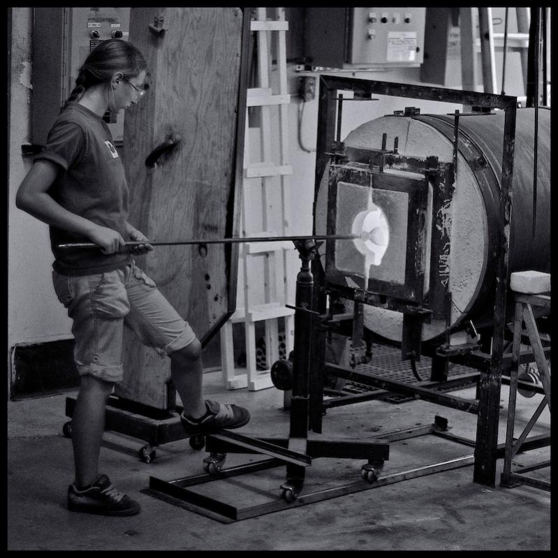
I had the chance to watch this young lady working in a glass blowing studio earlier on this afternoon. Glass blowing is something that I have always wanted to try. I could watch someone do it for hours. I think it appeals to me so much because the techniques and tools have not changed much in the last 100 years. I suppose Dale Chihuly would be the exception.
I'm not particularly fond of this image, and surprisingly, I don't know why. Usually, I can tell right away what's wrong with an image. Something is off with it, I can't put my finger on it. I'd appreciate some help if you don't mind.
Peace
Peter
www.peteranthonyphotography.com
Attachment 8802
-
2 cents.
Peter, for me the center of attention is where my eyes are drawn and in this case it’s the kiln which makes my eyes jump back and forth to what my mind thinks is the real center, the girl. The kiln pulls my view because that is where the highest degree of contrast is. The blacks and whites are all in the right half of the picture. Everything else is a mid grey and she is easily blended in on the left and too far out. Your metering may have done that if set on auto as it is a big chunk of the shot. I see a better photo for my tastes just by holding a piece of paper on the screen and blocking out everything to the right of the kiln door. Also, maybe due to the contrast, focus, or more likely some movement, the details of the kiln are sharper than the glass blower. If you get the opportunity to take more of these I would like to suggest you spot meter and focus on the person and make her more dominant than the kiln. That will of course blow out the white from the kiln fire but it’s already blown out anyway so a couple of more stops would not make much difference to me looking at it. There would have been a huge difference if this was in colour and the shirt was bright green, the pants yellow and the hair red. It would have pulled my view away from the muted kiln. In black and white it’s all greys though so you need to think, focus, meter and shoot the zone of you’re trying to convey to me as your audience. 2 cents.
-
This is not a bad environmental portrait, for me I wish we could see just a bit more of the girl's face, perhaps see some concentration on the task. That would make it more of an environmental portrait. There's not enough interaction with the viewer imo.
Andrew makes some very valid points.
Exposure-wise, for me, the left side of the shot is too dark and the girl could have used supplementary lighting. That whole side is very muddy (grey).
In terms of the girl's position, sometimes there's not much you can do...but for me that wooden column behind her head is a distraction. I may have tried to shoot from the other angle if the background was better.
Hope that helps - Marko
-
1 Attachment(s)
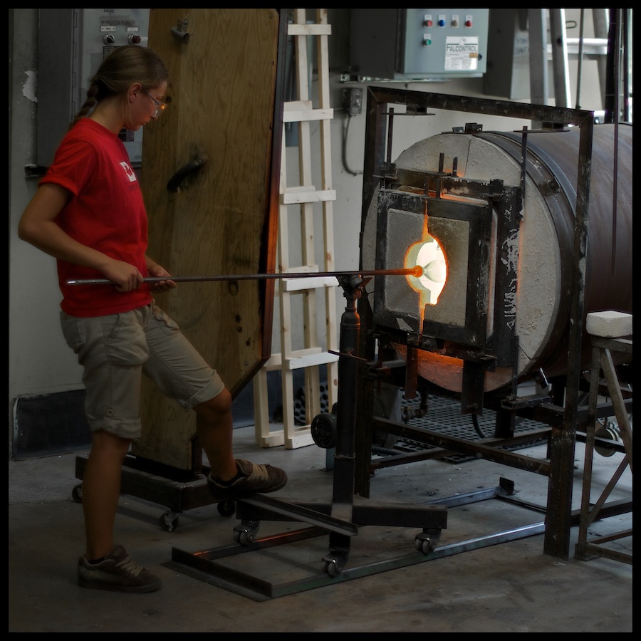
Thanks for the feedback guys. I agree with your comments for the most part. Here's the colour version. It pains me to say that it is an improvement upon the previous version.
Peace
Peter
peter anthony PHOTOGRAPHY - Home
Attachment 8831