Originally Posted by
Iguanasan

Thanks, everyone. The feedback is interesting as it's making me think :)
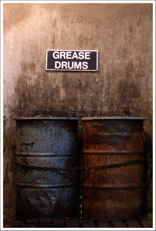
1) Grease Drums - I like the sign, I'd keep it in as I think it provides some sort of context and so I prefer to keep it in. The negative space above the sign is there as it's the standard 2:3 ratio for the shot's framing. I could manually crop it at a non-standard point but I didn't think it took away from the drums enough to do that. Apparently, I am unique in that opinion.
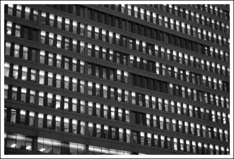
2) casil, not everything has to be B&W! Of course, not everything should be colour either :laughing: ;) I'll give it a try and see how it looks. Note that the Wall of Light is B&W so I'm not a total fanatic on colour. :)
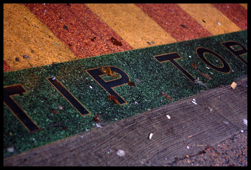
3) TipTop... hmmmm... I kinda really liked cutting the edge off of that. The pavement actually has "Tip Top Tailors", however, there was no way I was capturing all of that with my nifty-fifty unless I had a 12 foot step ladder hanging around :)